Oct 182025
 

https://substackcdn.com/image/fetch/$s_!5vrz!,f_auto,q_auto:best,fl_progressive:steep/https%3A%2F%2Flonglistshort.substack.com%2Fapi%2Fv1%2Fpress_kit%2F175577049.jpg%3FtextColor%3D%2523ffffff%26aspectRatio%3Dinstagram%26bgImage%3Dtrue%26hidePreviewText%3Dtrue%26isDraft%3Dfalse%26hash%3D86331169%26version%3D13

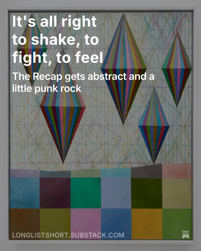
The Recap, my Substack newsletter, returns today with a focus on abstract art, punk rock, the American flag, the 90s, and more. It adds a little more dimension to what I post on the website and ties things together thematically.

Check it out and subscribe!

Sep 182025
 

Abstract expressionist artist Mark di Suvero‘s sculpture Declaration (pictured above) is located on the Venice Beach Boardwalk in Los Angeles. It was installed in 2001 to commemorate the Venice Art Walk’s 22nd year and in support of the Venice Family Clinic, a local organization that provides quality health care to those in need. Di Suvero turned 92 today, 9/18.

Although he is well known for his large sculptures, he is also a painter. Some of these works were shown in 2019 at L.A. Louver in Los Angeles along with some of his smaller sculptures (pictured below).

From the L.A. Louver press release about the paintings-

A selection of brilliant abstract paintings by the artist accompanies the sculptures. Like the sculptures, his paintings are never still. Created with dazzling colors in dense layers of linear and freeform gestures, they project a swirling sensation akin to the twirling movement in his three-dimensional works. Accented with phosphorescent paints, the works luminesce and reverberate even in the absence of light (and are especially dazzling when activated by black lights installed throughout the gallery space). “The heart of art is the search for form that is electrifying, that gives life to our vision,” explains di Suvero. “This is the language of emotion. Anesthetic is to kill feeling. Aesthetic is the opposite, aesthetic is feeling. The thing that is most important is the dream, the vision for what doesn’t exist that could exist.”

It was recently announced that L.A. Louver will be closing their Venice Beach space, but in happier news they will be donating the gallery’s complete archive and library to The Huntington in San Marino, California.

Sep 092025
 

In honor of artist Sol LeWitt‘s birthday today (9/9), here is his work Wall Drawing #1240, Planes with broken bands of color (Akron), located at Akron Art Museum. It was created in 2005 and installed at the museum in 2007.

The piece was drawn by Megan Dyer, Tomas Ramberg, Joe Ayala, Jennifer Bair-Shipman, Ashlie Dyer, Kathy Ilg, Sarah Sutton and Kelly Urquhart.

From the museum about the work-

Presiding over the McDowell Grand Lobby is a wall drawing by Sol LeWitt, one of the leading artists of his time. LeWitt’s approach to art stressed rigorous design and geometric abstraction, rejecting narrative, emotion and representation for the reality of art’s elemental components—line, shape, space, color and the most important, concept.

LeWitt began creating wall drawings in 1968 in response to his concern-and that of other artists at the time-that art was becoming too much of a commodity. These drawings are not so much physical objects as ideas. The artist conceived and planned them; his “drafters” (artists themselves) draw them directly on the walls of museums and public spaces around the world. Drawings may share forms and motifs, but each is unique and many, like Akron’s, are site specific.

Wall Drawing #1240 was created by the artist for the 18 by 34 foot wall where the museum’s historic 1899 building and its 2007 expansion interconnect. The triangular shapes refer to the angled supports and folded forms of the newer glass and steel lobby, while the blocks of color echo the brick wall removed from the south façade of the older building. Two drafters, assisted by area artists, worked for five weeks to fabricate the wall drawing.


Aug 182025
 

This mural by Micah Crandall-Bear was created for Sacramento’s Wide Open Walls Festival in 2017.

From the Wide Open Walls website about the artist-

Micah Crandall-Bear’s abstract landscape paintings examine Earth’s intrinsic resources and our disposition toward their accelerated transformation. His concept is infused with linear layers that cascade from atmospheric to subterranean. Landscape details hint at daily and seasonal shifts in light, evoking a sense of evolution and balance. In an ever-increasing technological world, his work reminds us to pause and admire our wild and natural surroundings. He presents abstractions that inspire a deep and effusive connection to nature.

Crandall-Bear achieves longitudinal depth by exacting precisely rendered lines and seamless expanses of color. This explicitly composed depth communicates a sense of contingency and locality. Micah’s construction of space is enhanced by his painting method. His ‘wet-on-wet’ method is a contemporary application of ‘alla prima,’ a traditional technique used mostly in oil painting, where layers of wet paint are applied to previous layers of wet paint. No matter how precise or general the area, Micah’s layered brushstrokes are decisive, but also gestural, often spanning the entire surface of the canvas from left to right. This highly active method of painting is sometimes tempered through rapid buffing and blending. The outcome is a smooth, boundless, and energetic surface.

As a Northern California native, Crandall-Bear established his artistic roots locally and continues to promote the growth of his community. His reputation brings him consistent national and international attraction from both private and public collectors. Micah’s work now adorns the walls of prominent corporations throughout the country, university hospitals, Facebook data centers in Malaysia, Sweden, and more. His work has been featured in ArtSlant, American Art Collector Magazine, Forbes, and PBS.


Jul 312025
 

The two large paintings pictured above are by Takako Yamaguchi and were on view as part of Whitney Biennial 2024: Even Better Than the Real Thing.

From the Whitney Museum website about the artist-

Takako Yamaguchi’s recent seascapes use meticulously rendered zigzags, tubes, and lines to suggest weather and other natural elements. They reflect Yamaguchi’s experimentation with what she calls “abstraction in reverse,” or taking recognizable forms, like clouds or waves, and abstracting them to the point of pattern. Her interest is less in nature itself than in the artifice that has allowed artists to represent it. The artist aims to paint “umbrellas” that will read as “trees,” referring to a quote by the poet Wallace Stevens, who said, “All of our ideas come from the natural world: Trees = umbrellas.”

The resulting paintings work against Western art historical ideas of “pure” abstraction. The luminous surfaces are intentionally decorative and structured using graphic techniques drawn from Mexican muralism and Japanese print design alike. Throughout her career, Yamaguchi has also resisted assumptions by critics that Japanese aesthetics are inherently minimalist, drawing from the most opulent and intricate aspects of Japanese visual culture.

Yamaguchi’s first solo exhibition in Los Angeles is currently on view at MOCA until 1/4/26.

Jul 252025
 

Maya Hayuk is one of the four artists on view in Brooklyn Museum’s Brooklyn Abstraction: Four Artists, Four Walls.  The other artists included are José Parlá, Kennedy Yanko, and the late Leon Polk Smith.

From the museum about Hayuk and this work-

With a diverse practice as a muralist, painter, photographer, gallery founder, and member of several artist collectives, Maya Hayuk has worked internationally to bring vibrancy and movement to urban and exhibition spaces. Weaving layers of paint, she animates walls with what she describes as “perfect imperfection.” These paintings, with their symmetrical organization and brilliantly overlapping colors and drips, are both constructed and improvisational, blurring perceptions of outer and inner space and confronting paradoxes of harmony and dissonance, optimism and hopelessness. Hayuk’s Ukrainian heritage as well as current geopolitical events inspire her to express abstracted physical and psychological landscapes of the war’s front line, simulating the flash points of explosions intersecting with the hope of sunrise.

The exhibition, which takes place on the walls surrounding the museum’s Beaux-Arts Court, remains on view until January 4, 2026.

Jul 242025
 

Filtered Yellow, 1968, by Ohio artist Julian Stanczak, is part of Cleveland Museum of Art‘s permanent collection.

From the museum about the artist and the work-

For more than a half century, Julian Stanczak maintained a distinguished career as an abstract painter interested in how vision works. Filtered Yellow features hundreds of alternating reddish and greenish razor-sharp vertical bands that create the illusion of a yellow shape, despite the absence of pure yellow paint. As typical of his work, it emphasizes a high level of technical mastery rivaled by few.

And from the artist’s website about his work-

“My primary interest is color – the energy of the different wavelengths of light and their juxtapositions. The primary drive of colors is to give birth to light. But light always changes; it is evasive. I use the energy of this flux because it offers me great plasticity of action on the canvas. To capture the metamorphoses – the continuous changing of form and circumstance – is the eternal challenge and, when achieved, it offers a sense of totality, order, and repose. Color is abstract, universal – yet personal and private in experience.”

“If I take time to really look at what I’m seeing, there is no limit to the secrets unveiled. I look to nature for clarification and crystallization, for things that I can use in my paintings. I live in the moment of recognition. In search for power through abstract clarity, I select shapes that have the maximum possibility for metamorphic action. We can only see what we understand!”


Jul 232025
 

Portia Mortensen, “Floating Landscape”, 2025, Colored crayon, acrylic, and oil on canvas

Work by Portia Mortensen

Wes Memeger, “Squares, Circles, Arcs and Lines Together”, 2019, Acrylic on canvas

Wes Memeger, “Homage to Venetians IV”, 2013 (top) and “Homage to Venetians II”, 2012

Haeley Kyong, “Harmonic Progression”, Oil on Canvas

Haeley Kyong, “In Pursuit of Invariable”, Oil on canvas

Currently at John William Gallery in Wilmington is Beauty in Unwavering Truths, an exhibition of geometric art by Portia Mortensen, Wes Memeger, and Haeley Kyong.

From curator Phoebe Caswell-

In a universe of great complexity, sometimes the quiet and simple things can resonate most deeply. The simplest shapes compose the form of many of our most rudimentary understandings of the world, and the laws of geometry are immutable facts that bind the very fabric of our existence. In Beauty in Unwavering Truths, artists Haeley Kyong, Wes Memeger, and Portia Mortensen investigate these fundamentals and highlight the beauty in the simple forms of squares, circles, and diamonds, each finding their unique aesthetic voices through experimentation in color, light, and composition.

Haeley Kyong works particularly in soft pastel colors and keeps her compositions abstract and minimalist. For example, Harmonic Progression, oil on canvas, 30 x 30 x 2 inches, is a mathematical expression of emotion. The painting’s gentle hues of pink and purple accompany the generous use of circles and squares to mimic the mathematical formula of the Fibonacci sequence. The spiraled pattern often appears in nature and is called the “golden ratio” for its aesthetic appeal. Despite its simple components, Kyong takes advantage of the golden ratio to create an aesthetically elevated piece.

The late Wes Memeger took a similar approach to his work, developing abstracted pieces from shapes he became enchanted by through his work as a polymer chemist. Like Kyong and Mortenson, Memeger found beauty in the simplicity of shapes and the evolution of each piece as he created each composition using the eternal geometric models. In his, Squares, Circles, Arcs, and Lines Together, 2019, acrylic on canvas, 72 x 72 inches, Memeger explores luminous warm tones to create a similar depth to his piece as the composition recedes into the background. Austere shapes and a lush monochromatic color palette form the complex pictorial structure.

Portia Mortensen, too, composes her work out of the foundational elements of shape and color. Her use of light and shadow plays with one another to simulate 3D forms in the diamond shapes, producing “spinners.” In Rainbow and Blue Spinners on Checkers, acrylic on canvas, 30 x 40 inches, the simple shapes seem to move on the canvas, the contrasting saturations adding to its depth. Of the three artists, Mortensen adds a stark asymmetry to her work with the roughly sketched diamond shapes to reinforce the beauty of the composed spinners.

Together, the works of Kyong, Memeger, and Mortensen serve as a compelling reminder that complexity is not a prerequisite for profundity. Through their shared focus on elementary shapes and disciplined exploration of light, color, and form, these artists reveal geometry’s quiet elegance and expressive power. Though rooted in the familiar, their pieces transcend the ordinary to evoke wonder, movement, and emotional resonance—showcasing that there is infinite space for artistic discovery within unwavering truths.

This exhibition will be on view until 9/25/25.

Apr 102025
 

“Pahari Picnic”, 2024, Oil on linen

“Abe”, 2024, Oil on linen

“Lago”, 2024, Oil on linen

The paintings in Catherine Goodman‘s Silent Music, her current exhibition at Hauser & Wirth, are filled with energetic brushstrokes and bright colors have the eye moving all around the canvas. Although abstract, it’s the hint of recognizable forms that encourage a more contemplative look.

From the gallery-

Opening in January, ‘Catherine Goodman. Silent Music’ presents a series of new, large-scale paintings by the British artist, where her characteristically expressive brushwork yields animated surfaces that pulse with the dynamic energy of their making. For Goodman, the studio is a place of spiritual meditation. Each painting represents an act of intimate transmutation—a way for her to turn closely held memories and personal vulnerabilities into newfound stability.

As the artist trustee at the National Gallery in London, Goodman has spent hours drawing from the collection and has developed a particular affinity for Old Master paintings, which she describes as her ‘only real teacher.’ Inspired by the intensity and drama of Renaissance masterworks by artists such as Titian and Veronese, and influenced by the poignantly psychological work of such groups as the London School, Goodman’s highly personal paintings transcend her individual experience, opening outward and inviting us in.

For decades Goodman has maintained a daily practice of drawing from observation. Through this she has constructed charged pathways between the physical world she observes and her own inner landscape. In these most recent abstractions, she often begins from landscapes and portraits that hold meaning for her. She then obscures these figurative grounds, building up evocative and densely layered compositions that invite sustained attention. ‘Lago’ (2024), a whirlwind of crimson, cobalt and lush green is one of many works named for a meaningful location or loved one whose spirit they embody. Other compositions, like the exuberant ‘Pahari Picnic’ (2024) or ‘Echo’ (2024)—monumental in scale and bursting with energy—give form to poignant memories. The substantial physical presence of these paintings, with their thick impasto and richly layered pigments, materialize intangible impressions of moments, places and people alike, as well as the psychological terrain encountered during the creative process itself. As the artist has confided to writer Jennifer Higgie, her artmaking ‘was never about problem solving. It’s about releasing something.’

Though rooted in the personal, Goodman’s oeurve uses the intimate act of painting to address the expansive macrocosm of collective experience. Her paintings act as a form of silent communication, resonating beyond the written or spoken word. Persistently forward-looking, Goodman’s latest body of work continues her tireless pursuit of art’s unique capacity to nurture connection.

This exhibition closes 4/12/25.

Mar 272025
 

“LOVE”, 1967, Oil on canvas

"LIP", 1960-1, Oil on canvas

“LIP”, 1960-1, Oil on canvas

Robert Indiana: The Source, 1959–1969, currently on view at Kasmin, presents a fascinating selection of the artist’s work from that decade. Several of his well known paintings like LOVE (pictured above) are included, but it is interesting to see his lesser known work as well as the progression in his work throughout this period.

From the gallery about the exhibition-

…Featuring 20 works drawn exclusively from the artist’s personal collection as endowed by Indiana to the Star of Hope Foundation, the exhibition includes an example from the artist’s first edition of LOVE sculptures, conceived in 1966 and executed between 1966—1968, and a vitrine display of archival materials including some of the artist’s journals. This exhibition marks Kasmin’s first collaboration with the Star of Hope Foundation, which was established by the artist in his lifetime, and the gallery’s eighth solo exhibition of work by Indiana since 2003.

Robert Indiana: The Source, 1959–1969 chronicles the Minimalist origins of Indiana’s signature use of signs, symbols, words and numbers. Pairing canonical works with those rarely seen by the public, the exhibition provides a deeper understanding of Indiana as an artist whose output remains emblematic of American culture. The paintings on view demonstrate the personal iconography the artist ascribed to his artwork: as his peers withdrew from the aesthetics of self-expression, Indiana embarked on a career-defining inquiry into the power of symbols to represent meaning. Organized thematically, the exhibition charts Indiana’s influential depictions of words and numbers in bold colors through his early abstractions, reflections on his personal history and the stages of life, and the poetic inevitability of transcendence—a return to the source.

From the gallery about LOVE and LIP

After discovering a trove of nineteenth-century packaging stencils in 1960, Indiana began incorporating words and numbers in his paintings, spearheading the adoption of commercial advertisement as a language of art. LIP (1960–61), an early example of a single word painting, features the title word’s yellow letters at the center of two intersecting orbs, whose contours suggestively form a pair of red lips. Unraveling the distinction between sign and symbol, the composition suggests a kiss, a universal bodily expression of love.

More selections and information from the gallery below-

“October Painting”, 1959-60, Oil on canvas

Indiana began this composition, which depicts the shadows of a dracaena plant, in October 1959. “This, I feel, is a very seminal painting,” he wrote in a journal entry the following December, seeking to distinguish his own visual language from artists Jack Youngerman and Ellsworth Kelly.

“Ra”, c.1961, Oil on canvas

From the gallery-

After painting a series of orbs in 1959, Indiana revisited the theme in Ra (c. 1961), a triptych arranging a number of red, blue, and green circles in flattened pictorial space. This work’s title reflects Indiana’s early interest in mythology, referencing the Egyptian sun god Ra, historically depicted with a red solar orb and cobra over his head.

Circles appear in Indiana’s work as early as 1958 and resound through paintings such as Mother and Father (1963-66) and Hallelujah (Jesus Saves) (1969). The arrangement of orbs in Ra suggests Indiana’s fascination with sequences, an avenue he would explore in paintings of numbers including Cardinal Nine (1966), on view nearby.

“Cardinal 9”, 1966, Oil on canvas

Indiana’s Cardinal Numbers series (1966) depicts the numbers one through zero in red, blue, and green. Adopting the typography of a business calendar, Indiana conceived of each number to represent a stage of life. Cardinal Nine represents the near end of the sequence, just before zero. The palette held sentimental significance for Indiana, who recalled memories of the red and green signage of Phillips 66, the gas company where his father worked, against the open blue sky.

“Mother and Father”, 1963-1966, Oil on canvas

From the gallery-

Indiana’s extraordinary diptych Mother and Father (1963-66) depicts the artist’s scantily dressed adoptive parents entering a Model T Ford within two circles, as if observed through a pair of binoculars. Conceived as the first to depict his parents in each of the four seasons, Indiana only realized one iteration of the series, set in the winter. Details of the vehicle’s license plate allude to Indiana’s conception ahead of his birth in September 1928, as if to mythologize the artist’s biography.

In an accompanying artist statement, Indiana described this painting as an essential part of his celebrated American Dream series (1961-2001), which earned Indiana’s first major recognition after early acquisitions by The Museum of Modern Art, Van Abbemuseum, Art Gallery of Ontario, Hirshhorn Museum and Sculpture Garden, and elsewhere.

Indiana exhibited this painting in an early state in 1964, later adding its stenciled lettering in 1966. He continued to exhibit the work extensively, including in the São Paulo Biennial in 1967 and his traveling institutional retrospectives of 1968, 1977, 1982, and 2013.

“August Is Memory Carmen”, 1963, Oil on canvas

From the gallery-

The number 8 held special resonance for Indiana, whose mother, Carmen, was born in the month of August. August Is Memory Carmen
(1963) incorporates the title of a lyric poem Indiana wrote in 1953, four years after her death. Indiana depicted her portrait alongside his father, Earl, in Mother and Father (1963-66), installed nearby.

This exhibition closes 3/29/25. It is presented in dialogue with Pace Gallery’s upcoming exhibition Robert Indiana: The American Dream, which will open May 9, 2025.