Apr 202023
 

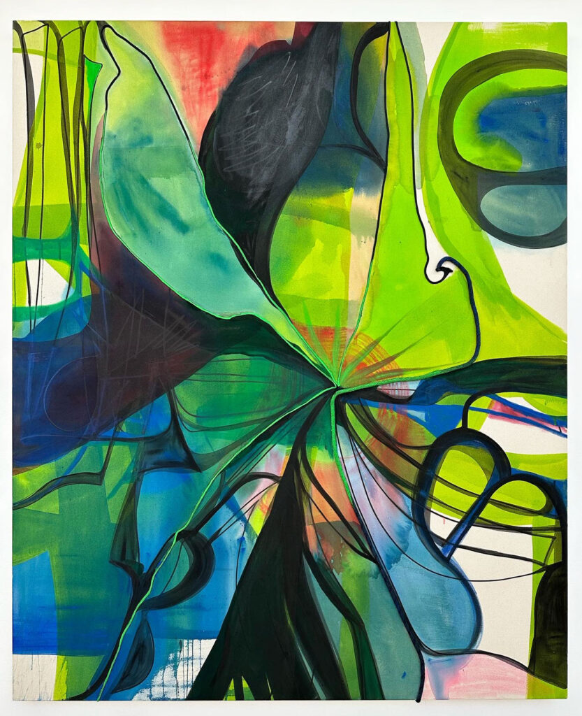
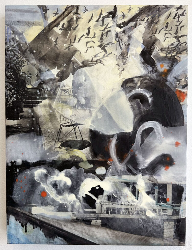
“Pink and green music”, 2023

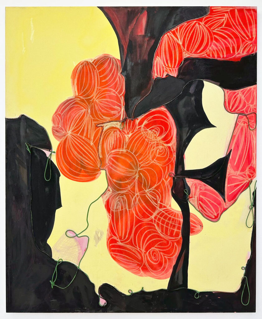
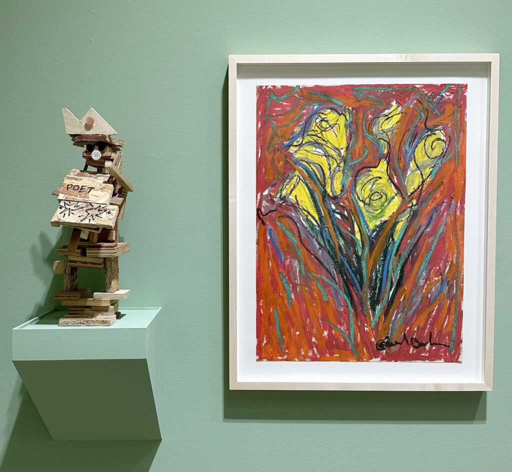
“What we re-quire is…silence”, 2023

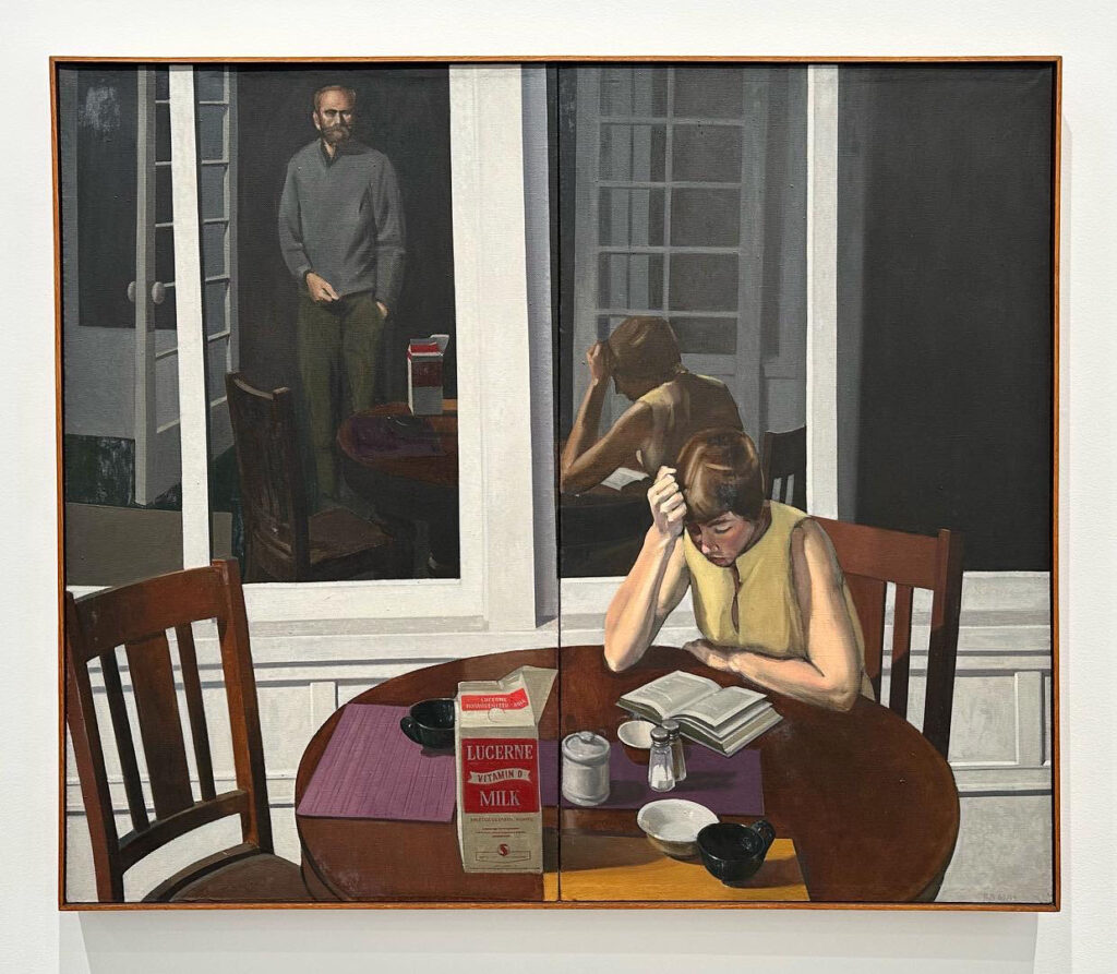
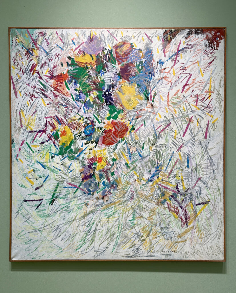
“Within the Lattice”, 2023

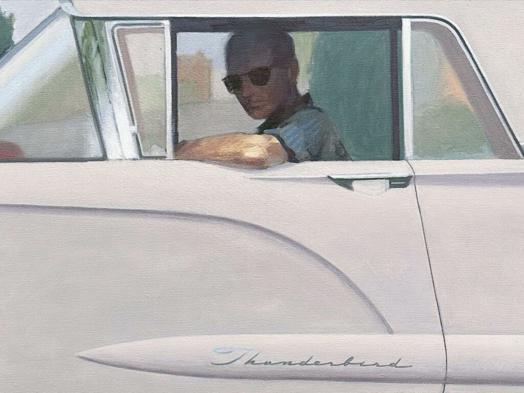
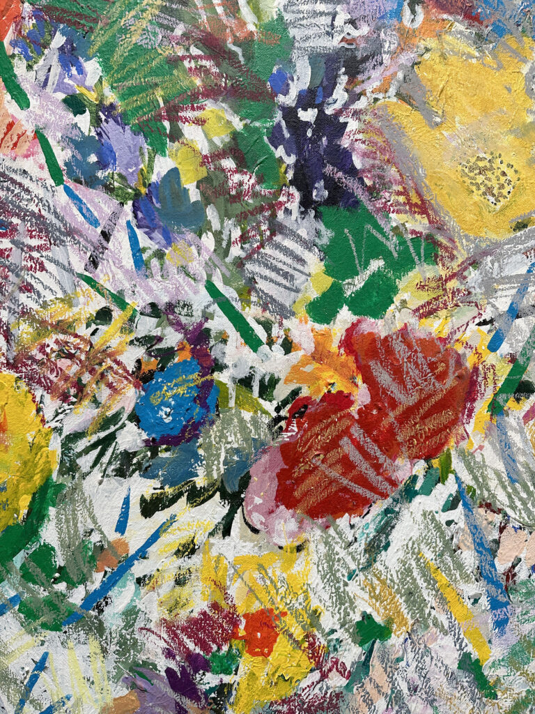
“An Ode to Hugs”, 2023

It’s the last week to see Kennedy Yanko’s exhibition, Humming on Life at Jeffrey Deitch gallery’s Wooster Street location.

Tonight, 4/20/23, she will be at the gallery discussing her work with Alteronce Gumby.

From the press release-

By employing paint skin and metal in ways that both transmute a bodily essence and reposition the weight of gravity, Kennedy Yanko wields materiality and abstraction with the possibility of intervening in the viewers’ perceptions. In Humming on Life, Yanko‘s first exhibition at Jeffrey Deitch, the artist continues this exploration.

Although the tactile quality and lyrical processuality of Yanko’s works emphasize their sculptural quality, the artist considers herself foremost a painter. In her new body of work, Yanko takes an approach to sculpture that reconnects it, and her, with painting. In recent years, the weathered paint and bruised patinas found on salvaged metal relics informed her palette for the paint skins. Now, the artist is introducing colors to the metal she finds. By painting the metal directly, underpainting, fire-cutting forms and compositions, and then crushing those new shapes, Yanko is expanding the definition of painting through her process. She remarks:

Working this way has been labor-intensive and has exposed me to sounds, like water thrashing inside a metal tank while cleaning it. Feeling that thrashing—hearing a power that felt like infinity incarnate—encouraged me to probe water as a medium and examine my intuitive method more closely, which seemingly only comes from physical exchange: input and output, expansion and contraction. In pulling water apart and becoming more curious about its behavior and participation, I’ve enjoyed revisiting the ways in which it’s a web of activation, a source, and information. It’s a cue and a salve and carries with it tinges of what it’s gone through.

What water did for me in that moment was to point back to the livingness of my medium — of the metal and paint skin I rely on — and wash away the binary between life and matter. Erasing this divide expands the possibility of experience; it gives materiality an abstract power that we yield to. It’s that vitality, found in color, form, attention and consciousness, that I hope this work can be a language for.

The “Illuminating Sound” presented apart of the exhibition, composed by Samuel Kareem, is derived from audio Yanko recorded while working in the yard. Kareem expanded one striation of sound within the clip—one small element he excavated from the layers of water, metal, paint and movement—and created 10 ten unique soundscapes. Each of the scapes corresponds with a sculpture within the show, and illuminates it. Listen to “Illuminating Sound” here.

Apr 202023
 

Closing on 4/22/23 is Amoako Boafo’s exhibition, what could possibly go wrong, if we tell it like it is, at Gagosian gallery’s Madison Avenue location.

From the press release-

When I’m making paintings, I want the characters to be strong, I want them to be free, I want them to be independent, I want them to be unapologetic.
—Amoako Boafo

Boafo’s large-scale portraits portray his friends and those he admires with candor, joy, and individuality. Focused on Black identity, his monumental paintings have already become key works in the representation of contemporary Africa and the African diaspora.

Boafo paints the faces and bodies of his subjects with his fingertips rather than a brush, the directness of his touch enhancing their expressive qualities. The works’ surfaces feature a gestural facture which the artist uses to model the figures’ anatomy. Making eye contact, Boafo’s subjects return the gaze of the viewer in an assertion of presence and identity, reflecting the artist’s interest in conveying charisma and individuality. The characters occupy domestic interiors, their casual grace reinforced by the familiarity of these settings.


Apr 202023
 

“Double Double”, 2023

“Creep”, 2023

“The Switch”, 2023

“Under The Sea”, 2023

“Under The Sea”, 2023 (detail)

“Hour Glass”, 2023

Currently at The Hole gallery’s Tribeca location are Jeremy Shockley’s imaginative paintings for his exhibition, Well, Look At That.

From the press release-

Across eleven large canvasses, Shockley depicts the intersection of painting as a window into landscape and painting as a cloth stretched over some wood slats.

Shockley, who has a background in art conservation, was helping to restore a Lucio Fontana painting when he decided to incorporate the renowned Spatialist’s slashed-canvas imagery into his own practice. After experimenting with actual cuts he arrived at his signature trompe l’oeil technique, beginning each canvas in big exuberant strokes with four- or five-inch housepainting brushes then progressing to eyelash-thin ones to simulate frayed threads along fake slits in the canvas.

He describes his first large series—painted flaps suggesting two eyes and a smiling mouth—as a response to the renaissance in portraiture that coincided with COVID lockdown. “I put faces on the beautiful landscapes as a way of saying that in the future people may want to go back to looking at them instead of people. We might be all right,” he says, “but perhaps the landscapes won’t be.”

The works in this show push the theme further: the natural world becomes a curtain to be tugged, a veneer to be peeled back, or a series of ever-darkening portals that nonetheless contain a dose of optimism. We are invited to think about alternate dimensions, about the structural materiality of the painted canvas, and about our kitten-like propensity to just “hang in there.”

This exhibition closes 4/22/23.
 

Apr 142023
 

“The Rake’s Progress”, 1991

“The Rake’s Progress”, 1991 (detail)

“Magnet”, 1992

“Magnet”, 1992 (detail)

“Stella Polaris”, 1990

Currently at Gagosian in NYC is Helen Frankenthaler’s Drawing within Nature: Paintings from the 1990s. The exhibition includes twelve paintings and two large scale works on paper.

From the press release-

My pictures are full of climates, abstract climates, and not nature per se. But a feeling. And the feeling of an order that is associated more with nature. Nature in seasons, maybe; but nature in, well, an order. And I think art itself is order out of chaos.
—Helen Frankenthaler

Frankenthaler’s celebrated 1952 composition, Mountains and Sea, was the first of her soak-stained canvases and was highly influential in the development of 1960s Color Field painting. By the 1970s, though, she had amplified her methods to include the expressive possibilities of surface inflection and density. Over the course of the 1980s, highly painterly canvases became her principal pictorial means, soon resulting in, during what would be her final decade, canvases of the greatest dramatic impact of her entire career, some of an unexpectedly large size.

Drawing within Nature features works dating from 1990 through 1995, made following Frankenthaler’s paintings retrospective which opened in 1989 at the Museum of Modern Art, New York. Composed in her studios in New York; Stamford, Connecticut; and Santa Fe, New Mexico—where she held a summer teaching residency at the Santa Fe Institute of Art in 1990 and 1991—these abstractions are inspired by the artist’s experience of landscapes.

Works in the exhibition include Poseidon (1990), more than eight feet wide, which calls on qualities of Frankenthaler’s earlier soak-stained canvases to evoke ocean currents, with its wet-on-wet passages of aqua, white, and green. The even larger Stella Polaris (1990) sets streams and patches of dense cloudlike white paint beneath the starlight of its title. Western Roadmap (1991) transforms the desert rock and glowing sunsets of the American Southwest into a stratified abstraction that hangs within an almost nine-foot-wide panorama. Reef and Spellbound (both 1991) lay out washes of rich, glowing color of varying density across dark grounds. The verdant hues of The Rake’s Progress (1991) suggest a garden in bloom, and show how Frankenthaler began to use gel to thicken her paint as well as combing and raking tools to create tracks bearing the imprint of the energy passing over the surface.

Painted a few years later, in acrylic on large sheets of paper, Flirt and Aerie (both 1995) are less grounded in memories of landscape vistas. Rather, their open, cursive forms invoke vividly colored and magnified details of drawing within nature.

This exhibition closes 4/22/23.
Apr 142023
 

“As the Crow Flies”, 2022

“As the Crow Flies”, 2022 (detail)

“As the Crow Flies”, 2022 (detail)

“As the Crow Flies”, 2022 (detail)

“Skunk Hour”, 2022

“Dogwood”, 2022

“Dogwood”, 2022 (detail)

There’s more to Nikki Maloof’s paintings than meets the eye in her exhibition Skunk Hour at Perrotin. The more you look, the more details- often dark- begin to emerge.

From the press release-

For Nikki Maloof, painting is a way to convey the experience of existing in the world—the light, the dark, and all the shadows in between. Her language is figuration: she started out with portraits of individual animals, progressing onto still lifes and, most recently, domestic interiors and landscapes populated with a mix of creatures—human and non-human; alive, dead, and inanimate. These subjects, on one level, have an everyday familiarity. Indeed, they are in many instances collected from Maloof’s immediate environment: for the past few years, her house and studio in rural Massachusetts. But the resulting depictions, however vivid, never feel quite real. The colors are bright, the shapes cartoonish, the compositions often implausible. Everything is emotionally charged. The eyes of dead fish seem to brim with sadness, the oversized blade of a knife glints with menace. A woman who shares Maloof’s physical features stands at a window with a glum expression, her face only just visible behind a tree dense with apples. Looking at these canvases is like looking at a series of dreams, governed by a mysterious logic, their characters and events freighted with ambiguous symbolism.

Of course, unlike in a dream, Maloof chooses what to paint: hers is a conscious artistry. We see evidence of this in her equally accomplished graphite works on paper, in which images are carefully worked out before she embarks on the larger oils on linen. (It’s fun to play spot the difference between the versions in pencil and paint: notice how a glass of wine materializes on a countertop; how a cat relocates from the landing to the stairs.) Perhaps her work is more akin to confessional poetry, intensely personal yet meticulously crafted. The title of this exhibition, “Skunk Hour,” is borrowed from a well-known poem by Robert Lowell, published in 1959, which begins as a light-hearted description of a seaside town in Maine and culminates in a self-portrait of a mind in turmoil. “I myself am hell,” wrote Lowell, “nobody’s here— / only skunks, that search / in the moonlight for a bite to eat.” Similarly, Maloof describes the scenes she constructs as “vessels,” giving tangible form to psychological states or particular thoughts and feelings.

The idea for this new series of paintings hatched last spring, when one morning the artist stumbled upon the birth of a fawn near her home, and later that day witnessed the body of a recently deceased neighbor being removed from his home. She decided that she wanted to capture the weight of being made simultaneously aware of the beginning and the end of life, as well as the tension between the mundane and extraordinary. There are no laboring deer or body bags here: instead, we get paintings like Life Cycles (2022), in which five plates are arranged in a circle, showing the progression of fishes’ lives from small orange roe on crackers to clean-picked bones. Or Burning Bush (2022), in which an empty bird’s nest rests inches away from a hawk dismembering its prey on a branch of the same tree. Whether taking the form of conventional still lifes or more expansive house-and-garden scenes, Maloof’s coded pictures make clear reference to the conventions of Western religious vanitas painting, with its representations of physical objects—flowers, food, skulls—to symbolize the transience of earthly pleasures.

If this sounds unremittingly heavy, it’s not. Maloof’s paintings also offer up many of their own pleasures, both intellectual and sensuous. It would be remiss, for instance, to ignore the slapstick wit in the detail of a rolled joint on a kitchen shelf in the work entitled Skunk Hour (2022): skunk here signifying not the foul-odored mammal but the just-as-pungent strain of cannabis. Life, as Maloof understands, is nearly always funny, even when things are pretty bad. And if you’re not in the mood to laugh, well, just try to resist the delights of the paintings themselves—their profusions of color, pattern, and texture. Extending the culinary theme, we might describe her work as a feast for the eyes. See how the coiling smoke from the lit joint rhymes with the squiggles of steam rising above a pair of artichokes in a colander; notice the thick scraped impasto of the howling cat’s bristling fur. Maloof is unabashedly maximalist in her approach to her canvases, layering both imagery and brushstrokes, at times threatening to overwhelm her subjects through an abundance of painterly gesture. This makes perfect sense. In such moments it becomes clear that, despite the universality of their themes, Maloof’s paintings are a vision of the world as seen through the eyes of a singular artist.

This exhibition will close 4/15/23.
Apr 142023
 

Thornton Dial, “Memory of the Ladies That Gave Us the Good Life”, 2004, Tin, carpet, wood, glove, washbasin, scrub brush, yard ornament, motor-oil bottle, paint brush, clothing, wire, enamel, and spray paint on wood

David Hammons, “Untitled”, 1976-77, Wire, rope, pipe cleaner, hair, rubber ball, mesh, aluminum, sand paper, thumb tack

Robert Rauschenberg, “Matt’s Defense (Scenarios)”, 2005, Pigment transfer on polylaminate

Dial / Hammons / Rauschenberg at David Lewis presents several works by the three artists that, although different in many ways, work together well.
From the press release-

This is the first-ever exhibition to solely bring together these three great American artists, each of whose conceptual ingenuity is expressed by way of material transformation and possibility. In particular, Dial / Hammons / Rauschenberg seeks to articulate the intersection between the American Duchampian legacy, as expressed in the material invention and possibilities of postwar Neo-Dada, and African-American traditions of redemptive, alchemical, and visionary practices based in found and discarded objects.

The exhibition ranges over more than 50 years; the earliest work presented is in Rauschenberg’s iconic 1962 assemblage Cartoon, then includes an early Duchampian wire, rope, pipe cleaner, hair, ball, and tack construction by David Hammons (Untitled, 1976-77), and then focuses on the 90s and 2000s, featuring four magisterial assemblages from Thornton Dial’s ‘high,’ most modernist phase of work, as well as an example of each of Hammons Kool-Aid and Tarp series from 2006 and 2007 and additional later Rauschenberg works. The exhibition also features two important sculptures: Dial’s Top of the World (1998), and Rauschenberg’s extraordinary The Lurid Attack of the Monsters from the Postal News, August, 1875 (Kabal American Zephyr) (1981). The largest work in the exhibition, Dial’s astonishing Master of Space (2004), conjures and critiques the iconography of American imperialism, military and corporate both (the eagle is made of neckties), while simultaneously calling upon and vengefully subverting the most classical of all modernist devices: the grid.

Every piece in the exhibition deploys, invents, and reflects upon the logic of assemblage: the Duchampian act of appropriation, transmuted in postwar America, into the language of assemblage, the Rauschenbergian combine. Dial / Hammons / Rauschenberg highlights these acts of American alchemy, and asks us to imagine their power and possibilities in ways which revise, expand, and complicate the history of modern and contemporary art, and weave a broader tapestry.

This exhibition closes 4/15/23.

Apr 132023
 

Closing on 4/15/23 is Sean Landers’ exhibition Adrift at Petzel Gallery in NYC.

From the gallery’s press release-

Featuring over twenty new oil paintings by Landers, this largely allegorical exhibition illustrates the complexity of artistic mortality using four protagonists: dogs—depicted in single portraits and alone in rowboats unmoored at sea; lighthouses; the ocean; and sperm whale skeletons at rest on ocean shorelines. Each subject represents the dichotomy of freedom and trepidation involved in the act of releasing art to an unknown fate. “…a bit of the artist remains in their paintings, so in that way, a painting is like an artist adrift in time and space,” says Landers in an interview with writer Johanna Fateman for the exhibition catalogue.

A cornerstone of inspiration for Adrift is Landers’ long-term interest in the work of American painter Winslow Homer (b. 1836—d. 1920) and in particular Homer’s ocean paintings. The vast and unpredictable ocean marks time and space, a preeminent symbol used throughout the years in Landers’ paintings and art history. Homer’s style is emulated by Landers in paintings throughout the exhibition including Northeaster, Summer Squall, and Yellow Dog.

Each of these subjects can be seen as a character existing within the vicissitudes of artistic practice. The dogs, at attention and alone in their boats, symbolize the vulnerability of art against an unknown future. These works also parallel Joachim Patinir’s (b. 1483—d. 1524) painting Charon crossing the Styx in which a human soul is being transported by boat into afterlife. Landers sees this as symbolic for what a painting is—a vessel for the artist into afterlife.

Two lighthouses, Portland Lighthouse, US and Sunderland Lighthouse, UK, are both welcoming and warning beacons, allegories for institutions that signal to the public what art is worth preserving. This ruling system will determine the dogs’ fate as they head into the unknown of art history. The bare whale bones, epic in their repose on the sandy shore echo the finality in the lifespan of an artwork. Such relics are epitaphs and beginnings, a sentiment imparted in We Hover, where Landers’ text painted over a fierce ocean reads: And then we hover in between existence and nonexistence in our paintings and that is both terrifying and reassuring. For Landers, Adrift is the everlasting reminder that the artist, like Patinir’s soul, is forever navigating the here and hereafter.

For added perspective on the symbolism, this is from Landers’ Instagram account

“The ocean represents time and space. The dog adrift in the boat is like an artwork adrift in time and space after the artist passes. The lighthouse is the institution that decides which art civilization will preserve. The whale skeleton is the fear of a life’s work gone unloved and allowed to die.”

Apr 132023
 

“Apologia, Apology”, 2023

“To Contain More…or Less”, 2023

“The Air Was Heavy”, 2023

“4:33 AM”, 2023

If a picture is worth a thousand words, Timothy Lai’s paintings for Double Wall at Jack Barrett may be worth a few more. Everything feels tense and uncertain in the work, leaving the viewer with questions that they must answer with their own stories.

From the press release-

“Memory is a choice. You said that once, with your back to me, the way a god would say it.” 

– Ocean Vuong

In Timothy Lai’s exhibition Double Wall, things left unsaid reside in waiting. Silence crouches as an omnipresent figure living within the familial unit, unleashed sometimes as performative protection, and at other times, leashed as a placeholder against emotions that cannot or will not be articulated. Amid this verbal lack, Lai’s work materially bristles. 

The works in Double Wall reflect their domestic setting, showing vignettes of encounters between family members. These encounters are pushed compositionally, almost theatrically, to the foreground, pulling the viewer to witness these skirmishes. The works in Double Wall teeter on the precipice between conflict and resolution. In Apologia, Apology, the figures reside in the margins, in a non-confrontational stasis of pause. The air vibrates with the “dot dot dot” of feelings inarticulable.  This tension Lai builds up in heavy impasto; the architectural negative space becomes an actor within the dynamic. 

If Lai’s previous body  of work centered around the misrecognition between father and son, Double Wall reads the effect these patriarchal structures have on the parental figure, and how inevitably, they are the heirlooms that make up the next generation’s inheritance. In Coronation, a person stands atop a stool with their back to us, arms hanging limp at their side as a shadowy figure in the background configures the suit jacket around their body.  The suit, a uniform to gain social currency, and a mantle of white-Western authority, trickles down patriarchal economics to bestow the role of family leader on a new individual. The sharp geometric lines of the suit trap the fleshiness of the central figure.  The transference uncovers the mutable masculine roles of father and son. Inherent in this piece is a subtle formal nod to the Crucifixion; Lai deftly gestures towards how the embodiment of these patriarchal roles can be similarly sacrificial, trading individuality to conform to the family unit, to become martyr.

In the other works, silence also sires assimilation. Mirrors appear often. In the work, To Contain Less… or More? a figure, bound up in the suit jacket, is caught between a chinoiserie and a colonial eagle mirror. Lai explores the triangulation of these three elements as a space that reflects the nuanced ontology of existing as a person of color in the United States. The figure departs the composition, leaving suit behind, alluding to the difficulty of choosing to engage, assimilate with and perform into these predetermined frameworks. 

The uncertain site between the binaries of stasis and movement, silence and conflict are a running theme throughout the show. Depictions of a window-framed outside world are too small to envision moving through. A hand held mirror resting on an armchair reflects a closed door. Double Wall makes this tension visible, and Lai offers us no clear resolution. We are forced to sit within the pauses, breath held and on the cusp of speech.

This exhibition closes 4/15/23.

Apr 122023
 

“With a Full Heart”

“Unforbidden Pleasures”

“Unforbidden Pleasures” (detail)

“Wild Nights”

Currently at the Creative Pinellas gallery is Yolanda Sánchez’s Out of Eden, a collection of her paintings and textile work. The gallery is filled bright pleasing colors and this is the perfect exhibition to celebrate the spring season.

On the Creative Pinellas website, Sánchez discusses her work in a detailed essay. Below is a section of that piece.

Whether in painting or textiles, my working instruments are rhythm and color. I am interested in the joyful, playful or even spiritual properties of light. I am reflecting the light and color of where I live, of my immediate environment.

This artistic practice is improvisational and process-oriented, abstract. The relationship of one color to another creates a rhythm and tempo and establishes the composition. Each color suggests the next color, almost like the “call and response” form found in many musical traditions. There is a continuous orchestration, as the colors converse with one another, suggesting a mood or vibe.

I am often not sure where it is going or going to go. It is a surprise at every turn. I shape my perception as I work.

My textile work is informed by the Korean art form known as Bojagi. Humble in its origins, nameless women made these traditional textiles as often extravagant visual pieces using mundane, leftover fabric from wrapping, storing and transporting goods. Over time, the nobility introduced finer, more delicate cloth.

In its traditional form, design characteristics include stitching and seams to create linear elements, especially with translucent fabrics. These features differentiate and distinguish Bojagi from patchwork textiles found in other cultural traditions. Nevertheless, Bojagi shares what feminist art historians identify as centuries-old histories of turning scraps of fabric into beautiful objects and ultimately shifting perspectives from private to public.

I pay homage to these unknown women, authenticating their domestic work – and I affirm their values of inclusion, pleasure, love, the familial, the decorative, the colorful and joyful, the spiritual and the everyday.

My Bojagi-inspired textile work – painting with thread and fabric – honors the Korean tradition. Still, while relying on the conventions and basic structure, these pieces extend and interpret the Bojagi into a more contemporary form. I offer a new direction by varying medium and size and utilizing color compositions and stitching techniques less anchored to established methods.

Material, color, texture and transparency are crucial elements in this work, as is the geometry inherent in the design. While geometry, in this case, emerges from a particular culture, the form does not demand a specific culture-dependent response. Its only function is beauty. It is about the sensual delight derived from looking – the viewer can ascribe or chose meaning, if at all.

As an order, rhythm and pattern are generated within the geometry, creating beauty through harmony and stability, color dominates as a suggestive poetic force, concurrently evoking a connection to my immediate tropical environment. It sets as my intention arousing a sense of place, a feeling, and the atmosphere of an abstract garden, or even a walk through a field of flowers.

It is the color but also the sensuousness of nature that I endeavor to suggest in both my paintings and textiles.

This exhibition closes 4/16/23.