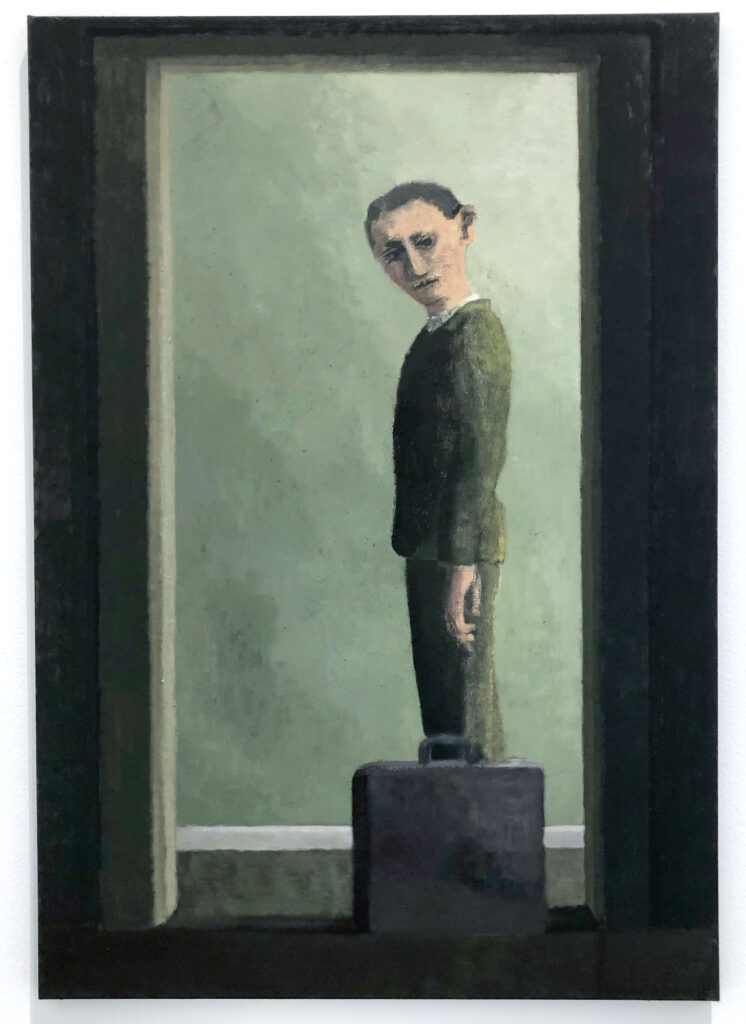
Untitled (Man with Briefcase), 2019, from Lenz Geerk’s 2019 exhibition Mixed Blessings at Roberts Projects in Los Angeles.

Untitled (Man with Briefcase), 2019, from Lenz Geerk’s 2019 exhibition Mixed Blessings at Roberts Projects in Los Angeles.

Potatoes, Grapes, and a Lemon, 2019

Pear and Cherry Juice, 2019
These paintings are from Holly Coulis‘ 2019 exhibition Stilly at Philip Martin Gallery.
From the press release–
Holly Coulis’s paintings operate as stages where still life scenes unfold. A table, or tables, create an initial structure where simplified, geometric forms are arranged and interact. There is a sense of order in these scenes as though the fruits and dishes had been laid out by some external force. Through layers of paint, linear elements are created, giving the illusion of colorful stripes or energy fields around individual objects. These works feel familiar, but upend our sense of figure/ground, horizon-line, perspective, and scale. In these newest paintings, the still life begins to verge into abstraction.
Coulis works from a visual vocabulary built up over years of practice, and the sense of discovery and newness in her works occurs as she continues to explore her own paintings and their possibilities: “I rarely look at a scene. It’s more about shapes of things I know. Things like oranges, lemons, cherries: they’re all very easy shapes.” Standing in front of her works, we are immediately involved in a scene of pleasure and abundance, surprise and stimulation – a stimulation that is physical, intellectual and aesthetic.
Her new exhibition, Orbit, which also includes her sculptures, is currently on view at the same gallery in Culver City until 7/2/21.
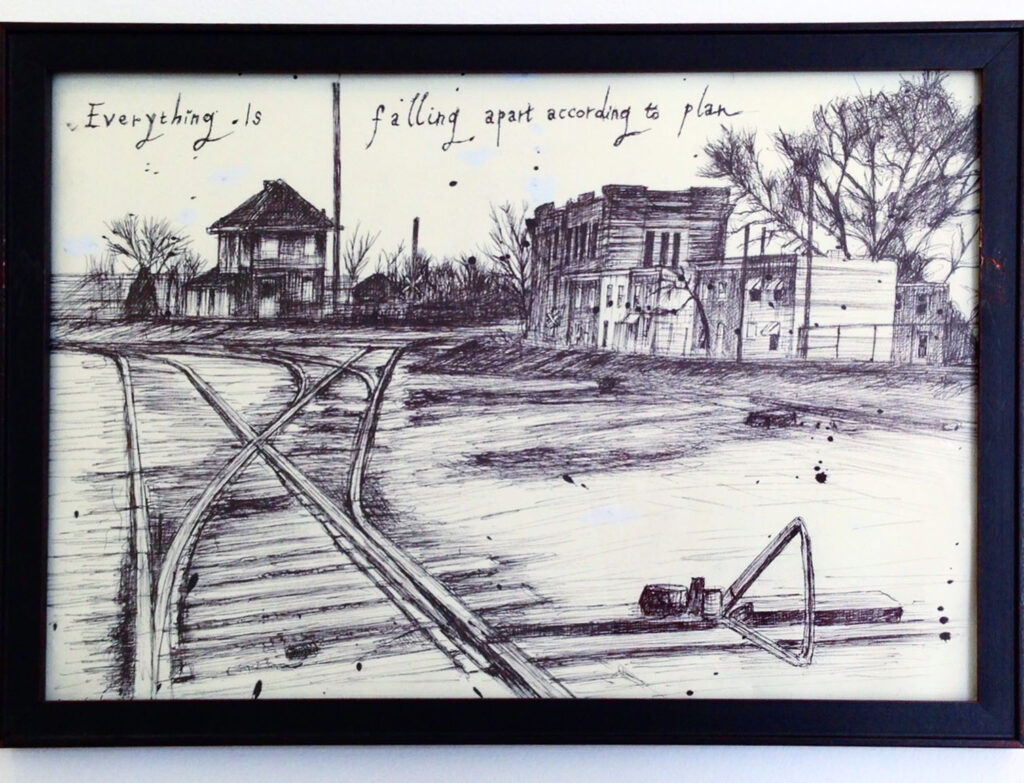
Everything is falling apart according to plan, one of artist and writer John Tottenham’s works from his show The Indifferent Sublime, at Maloney Fine Art in Culver City in 2014.

sweater man, 2017
Sand and Ice, 2017-19
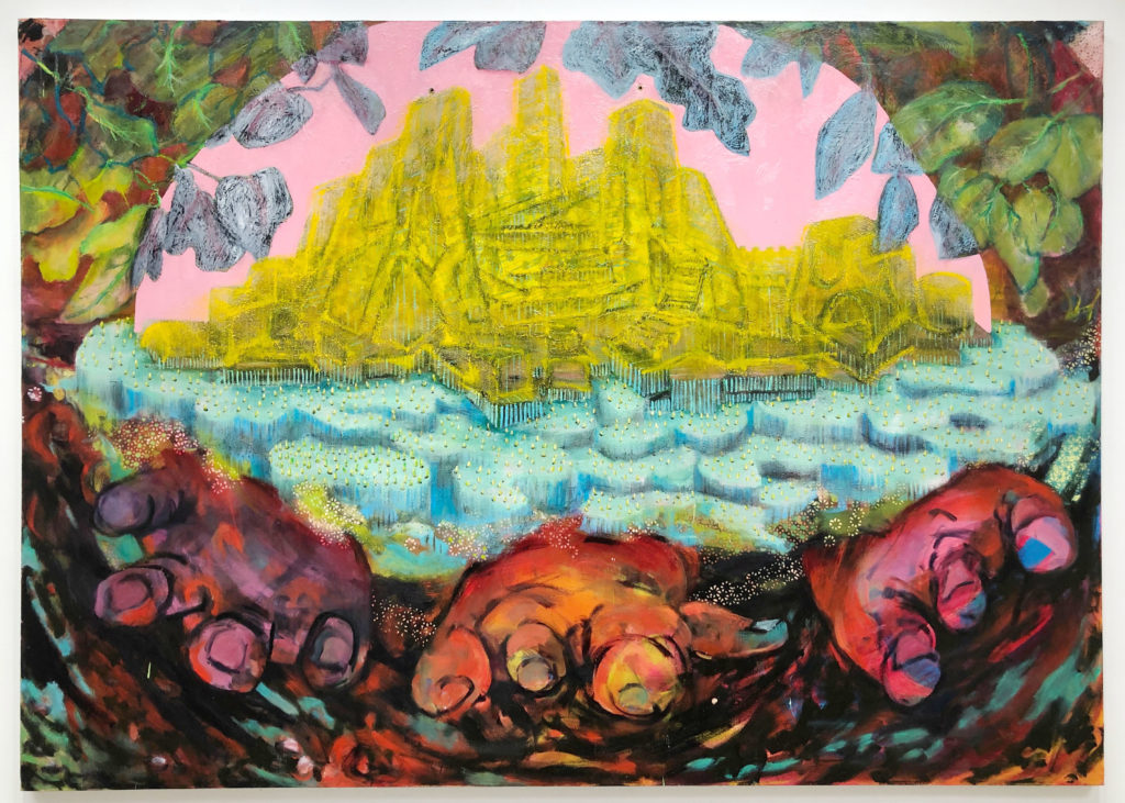
Currently at Klowden Mann is Alexandra Wiesenfeld’s exhibition They found ritual and order but couldn’t see the real (year 3008), her fifth solo exhibition at the gallery.
From the press release-
The show features a series of large-scale oil paintings on canvas in which Wiesenfeld imagines a heightened future Earth–long after the climate has tipped–with few humans and very little evidence remaining of our time dominating the planet. The works are non-narrative: abstracted landscapes formed in vivid colors, offering the state of mind and eye of a future on the other side of our current strategy of dominance at all costs, and its consequences…
Wiesenfeld’s new works are visual representations of a time past the context of the structures humanity has built, and the vast resources we have mined and violence we have justified to sustain them. In her statement, Wiesenfeld writes, “Painting these invented landscapes is as much about climate grief, escapism into a sci-fi world as an act of devotion to the beauty of the natural world, even if no longer viable for us. They are about the human need for myth-making when facing landscape alone.”
Wiesenfeld forms the paintings through layers of color without a referent; made from imagination and impulse, there are often many stories of imagery and tone under the final painting. Several of the paintings include grids of colored dots that disappear and reappear on the surface, under and over forms that feel like rocks, flesh, plant life we have never seen. The dots often appear as a partially-formed system of analysis–visual schematics through which to understand land that is no longer familiar…
This show closes 1/11/20.


Blum & Poe in Los Angeles is currently showing two very different exhibitions. In the main gallery is a selected survey of work by Harvey Quaytman spanning three decades.
From the press release-
Harvey Quaytman (b. 1937, Rockaway, NY; d. 2002, New York, NY) came of age in the downtown art scene of 1960s New York, living and working in SoHo studios first on Grand Street and later at 231 Bowery, where he would remain through the late ’90s. Long considered an artist’s artist, the painter enjoyed a close-knit and vibrant artistic and social milieu, over the years sharing studio addresses with Brice Marden, Ron Gorchov, and James Rosenquist, among others. Quaytman’s emerging career as a young painter began in the heyday of Ab Ex with a marked allegiance to Gorky and de Kooning. This approach was slowly shed as the decade unfolded, as his work began to lean towards sculpture—compositions with curvilinear shaped canvases and rectilinear U-shaped bases that inhabited a newfound objecthood. This was followed by a forty-year engagement with geometric abstraction, his approach to painting in contradistinction to the prevailing trends of the era—first with Pop Art and later Neo Expressionism. Despite painting being declared “dead” by Minimalist and Conceptual artists of the time, Quaytman maintained a commitment to the medium and to his vision throughout, helping to shape an alternate trajectory for American painting.
The artist’s work in the ‘70s developed into shield-like forms that balance on curved platforms, conjuring a motion that would result in a critic calling them “rocking rectangles”—the body of work later known simply as “rocker” paintings. These eccentrically shaped works were hand-crafted (he would steam and bend the wooden stretchers himself), and inherently related to movement—inspired by Islamic calligraphy, rocking chairs, and the flight patterns of airplanes and birds. His experiments with shape continued in the late ‘70s, and through the manipulation of geometric intersections and overlapping forms that all the while imply motion, a unique group of paintings resembling anchors or pendulums emerged. In the 1980s, Quaytman began his cruciform paintings, investigations of the cross shape not as emblem but as two meeting vectors; Constructivist, perpendicular geometric compositions that focused on the reduced palette of black, white, red, rusted iron, and metallic gold. While these paintings represented a stark departure from his previous work, Quaytman continued to pursue visual movement as he conjured an interplay of symmetry and asymmetry.
Many of the works become even more intriguing up close. His use of different materials to achieve varying tones and textures makes them come alive.
The press release discusses a bit about his process in creating them-
As his paintings evolved in form and shape, variously touching upon Abstract Expressionism, Minimalism, Process Art, and Constructivism, Quaytman simultaneously developed a rigorous practice of experimentation with pigment. He was interested in the history, alchemy, and chromatic effects of color, seeking out unique tonalities at specialty stores at home and abroad, becoming a master of color and texture. He skillfully poured paint, spreading Rhoplex over canvas with broad wallpaper brushes after dusting it with pure pigment that settled in thick, unpredictable strata. He later flecked canvas with glass or iron filings and used additives such as marble dust in paint he always mixed himself. On this subject, he said: “It is very important to me to be reminded that I am not an alchemist but a man engaged in coded, layered conversation with my fellow man on what I hope to be (on another) level than words or music.”
On the second floor are Matt Johnson’s delightful sculptures whose familiar materials seem to defy gravity as they balance on each other in the compositions.


From the press release–
In an ever-expanding practice in search of the peculiar and the sublime, Johnson elevates the mundane to the exceptional. With a new body of work in carved and polychromed wood sculpture, Johnson depicts configurations of raw industrial materials from cinder block, brick, rebar, to traffic cones—permutations of information composed according to gravity, balance, and primitive instinct. A crude horse, a procession of block figures, cantilevered props, and fragile towers make reference to the concept of knowledge with small gestures—a lighter, a match book, a lightbulb, an atlas, and a monograph on Matisse. The doweled joints of glue and/or epoxy between bricks, blocks, and bars exist here not to defy gravity but to freeze balance and preserve delicate moments of experimental groupings. Like a still life, these works are organized information, like subatomic particles, atoms and elements, molecules and compounds, glued by gravity, and magnetic polarity, surfing in a sea of electrical conductivity.
Both of these exhibitions close 1/11/20.

Death March, 2012
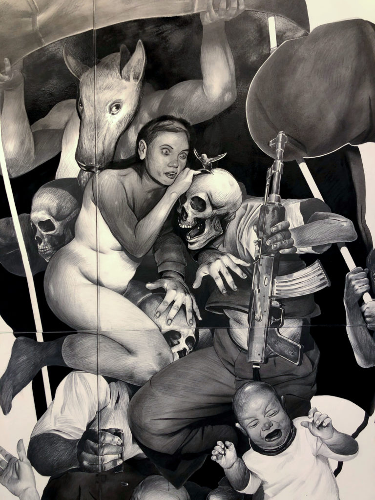
Death March, 2012 (detail)
Currently at Luis de Jesus Los Angeles is Hugo Crosthwaite’s incredible exhibition, TIJUAS!(Death March, Tijuana Bibles, and Other Legends).
From the press release-
Hugo Crosthwaite has spent much of his adult life working on both sides of the U.S. and Mexico border, observing and documenting the extraordinary ebb and flow of humanity that makes this region one of the most existentially dynamic places on the North American continent. In Tijuas!, Crosthwaite will present selections from several bodies of work that continue his exploration of this ever-evolving culture, among them the Tijuana Bibles, a new series of animated videos and books, recent graphite-and-ink on canvas and panel paintings, new Tijuanerias ink drawings, and Death March, a phenomenal and monumental work that preceded his celebrated performative murals. This will be the first time this work will be presented since it was commissioned in 2010 for Morbid Curiosity: The Richard Harris Collection at the Chicago Cultural Center.
This exhibition closes 1/4/20.


Tammi Campbell’s exhibition Boring Art at Anat Ebgi in Culver City takes on the male dominated art world canon in a fun way. She’s recreated iconic works and then covered them with bubble wrap, packaging tape, and cardboard corners. But yet those materials are an illusion. They have been made with acrylic painting medium.
From the press release-
The gesture of covering these works emphasizes the preciousness of the goods they contain, while simultaneously highlighting the frequently invisible network of art world laborers, art handlers, shippers, registrars, studio assistants, etc. who support and care for them as they circulate. The coverings also obscure the originals and draw our attention to their fixed state of transition.
…Campbell is concerned with memorializing art history, while also making a break from it. Her work literally envelopes, secures, and mummifies historical paintings; it asks viewers to ponder what is valued and allows us to imagine making room for something new. Full of contradictions, Campbell’s work pays homage to the past, while simultaneously taking it hostage.
The title, Boring Art, is a reference to John Baldessari’s I Will Not Make Anymore Boring Art, but this exhibition is anything but dull. See it before it closes on 10/26/19.


From the press release-
Klowden Mann is proud to present San-Diego-based artist Andrea Chung’s first solo exhibition with the gallery, … Only to meet nothing that wants you. The exhibition features large-scale cyanotype works depicting under-sea images of coral that have then been bleached with sugar crystals—a material woven throughout Chung’s practice for over a decade in reference to its relationship to colonialism in the Caribbean. The cyanotypes are placed in context with a brass chandelier that recalls designs from the 19th century; where crystals would hang, Chung has hung glass vials filled with sugar in various shades.
Chung’s practice often utilizes perishable and precious materials with strong underlying histories, forming relationships to pre-emancipation images of the Caribbean, touristic misrepresentations of people and place, the export or import of goods and materials, and the labor of the human body. Completing the quote by Nayyirah Waheed that Chung used as the title of her first solo museum exhibition at the Museum of Contemporary Art San Diego in 2017, “You broke the ocean in half to be here,” the title of the exhibition at Klowden Mann answers with the second half of the phrase, “…Only to meet nothing that wants you.”
In the cyanotype works, coral bleaching becomes a metaphor for colonialism, and the expanding of the philosophy and impact of imperialism on colonial populations and cultures. The addition of sugar crystals to the already highly sensitive cyanotypes underlines Chung’s interest in creating work that defies the notion of artworks as static objects that are meant to remain unchanging and unyielding in the face of shifting environments and time; in a way that also reflects the constant uncontrolled and irresponsible effects of human actions on the environment, and on vulnerable populations. The works are intended to shift and change over the course of the exhibition, as the sugar embeds further in the cyanotype, falls, and expands. The works are linked to the environment in which they are placed in a way that Chung cannot predict and control—and along with the chandelier, ask the audience to consider who pays for the superficial opulence and beauty to which so many have become accustomed.
The work in this exhibition is really stunning, and the fact that it is work that is changing with time, makes seeing it feel even more special. Like so much of the beauty in the world, and especially in nature, you appreciate it, while wondering how long it will still be around to be seen.
This exhibition closes 10/12/19.
![]()
This mural was created for POW! WOW! Antelope Valley 2018 in Lancaster by Amir H. Fallah. If you have been in Los Angeles recently you may also have seen his mural outside of Baik Art in Culver City. It was completed in May 2019.
For more of Amir H. Fallah’s work check out his website and Instagram.

