Oct 022025
 

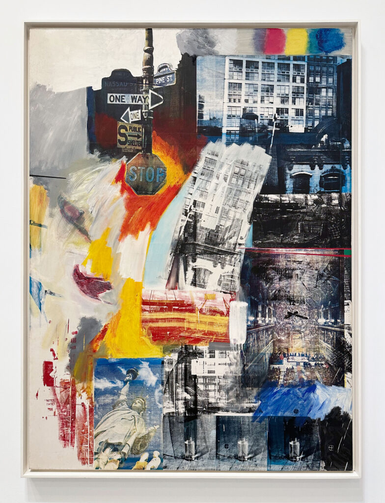
Corita Kent (Sister Mary Corita)’s print I Should Like to Be Able to Love My Country and Still Love Justice, 1968, was on view at the Museum of Modern Art in NYC in June of 2024.

From the museum about the artist-

Corita Kent, also known in the Catholic Church as Sister Mary Corita, incorporated a range of references into her silkscreen prints, spanning pop culture imagery and song lyrics, biblical allusions, and literary conceits. After seeing Andy Warhol’s Campbell’s Soup Cans in 1962, she was inspired to embrace the language of Pop art, using bold, graphic designs to convey anti-war messages. In the 1980s Kent’s posters and ephemera were collected by PAD/D (Political Art Documentation/Distribution), a New York-based art activism group with a mission to create an archive of politically concerned art and ephemera from around the world. The materials are now part of the MoMA Archives, Library, and Research Collections.

You can currently see some of her photographic archive at Marciano Art Foundation in Los Angeles for the exhibition Corita Kent: The Sorcery of Images, on view until 1/24/26. The show “focuses on a little seen part of Corita’s artistic practice: her archive of over fifteen thousand 35 mm slides that she and her cohorts took between 1955 and 1968 while she was a beloved teacher in the art department at Immaculate Heart College”.

As part of their press release they include this lovely quote from the artist-

“In a sense, the whole world around the artist is his source, his sorting and relating powers are his sorcery, and the one isn’t much good without the other. … Anything can be a source, even a mistake. The sorcery or the thievery is the art of relating sources into a new solution.”

Her work can also be seen in Los Angeles at the Corita Art Center. The center is free to visit on Saturdays (with appointment).


Apr 092025
 

“Brownfield”, 2023-2024, Multi-color woodcut on fabric

“Our House is on Fire”, 2023-2025, Multi-color woodcut on fabric

“Our House is on Fire”, 2023-2025, Multi-color woodcut on fabric (detail)

“New York Street; Rainy Day”, 2023-2025, Multi-color woodcut on fabric

“New York Street; Rainy Day”, 2023-2025, Multi-color woodcut on fabric (detail)

For Zorawar Sidhu and Rob Swainston‘s exhibition Flash Point at Petzel they have created three series of works reacting to various environmental and political events. The large-scale brightly colored woodcut prints on fabric, three of which are pictured above, created for History is Present, are especially impressive.

From the gallery about all three series-

Their series of large-scale, multi-color woodcut prints on fabric, titled History is Present, considers the age of the Anthropocene and the relationship between human impact and shifting natural geographies. Referencing canonical artworks, Sidhu and Swainston lend iconic visual allegories to lasting social conditions and humanitarian issues; for example, their “Raft” depicts contemporary displaced peoples and a history of forced migrations. Made using a custom-built press to accommodate the scale of these works, these monumental woodcut prints demonstrate a mastery of technique and process, with layers of tonal values building complex compositions.

Their second series, War for the Union, features mixed woodcut with silkscreen prints on paper, looking toward distinctly American political issues from recent history. Layered with appropriated images from news media wood engravings of the civil war, such as Winslow Homer’s Civil War drawings for Harper’s Weekly, this series suggests both the cyclical temporality of images in American journalism and a collective fear of a second civil war in our current climate. War for the Union depicts scenes from pivotal moments of civil unrest, including demonstrations following the overturning of Roe v. Wade, 2024 pro-Palestinian protests on university campuses, the 2024 Republican and Democratic National Conventions, and the 2017 Charlottesville white supremacist rally. Through rigorous, vibrant layers of figures, rally signs, and geographies, Sidhu and Swainston slow down the processing of mass circulated images, the antithesis to our current barrage of news media.

The third series, a group of color etchings made in collaboration with Columbia University Neiman Center for Print Studies titled Spring Wake, highlights environmental issues in various regions, rendering signposts of protest with native plants of the respective terrain. For example, “Japanese Lily” layers images of activists protesting the radioactive water released from the Fukushima nuclear power plant into the sea, while “Fairy Primrose” depicts protests of the ecocide resulting from the ongoing Ukraine War—each indigenous flora overlaid atop the local environmental threat. Bearing an almost documentarian quality, these prints link political turmoil and climate disaster intimately with the depicted landscapes.

The exhibition title, Flash Point, defines not only the point of combustion, but also the instant at which a person or event flares up, suddenly exploding into action or being. Using woodcut printmaking, one of the oldest forms of mass communication and a means to propel revolutions, protests, and social movements, Sidhu and Swainston address structures of power and our relationship to hegemonic forces. The artists examine contemporary cultural conflicts through an unraveling of modern news media to reveal its canonical underpinnings, reaching back in time to consider how news images are represented, circulated, and consumed.

This show is closing on 4/12/25.

Jul 192024
 

Rita Ackermann is currently showing work at both of Hauser and Wirth’s Chelsea locations for her exhibition Splits. At their 22nd street location are her paintings and at the 18th street location are large silkscreen prints. The figures in the paintings mix with the more abstract elements to create work that keeps the eye moving and engaged.

From the press release-

Titled ‘Splits,’ Ackermann’s latest paintings mark a pinnacle in the artist’s ongoing concern with the creation of dynamic, moving images. In these canvases, forms cascade downward and upward, at times merging seamlessly into one another. To optimize the potential of such chance transformative processes, Ackermann conceptualized the canvas as divided into three screens, as she aptly calls them. This enabled her not only to guide the flow of line and paint, but also to forestall the coalescence of drawing and painting. No sketch prefigured the images that surfaced, except those carved into the recesses of her memory. Instead, Ackermann allowed an instinctive force to guide her hand as it moved across the fields before her.

The fluctuation between the screens she populated with diaphanous lines and those carrying weightier, gestural strokes of color also conspired to infuse the paintings with an unexpected rhythm. In ‘Shut Eye’ (2023), for example, two screens brimming with fragments of drawn shapes entice the eye to actively pull open the middle register and thereby show more of the painted forms within. This occurs even as the upper and lower screens seem to press inward, creating a dynamic tension between revelation and concealment. To enhance this impression, Ackermann occasionally used luminous yellow pigment to further instill in these paintings a sense of lightness and transparency.

Composed as a sequence of stacked-up semi-translucent frames, these canvases can also be seen as the visual equivalent of images imprinted on a film strip. Ackermann, in fact, draws parallels between the transformative essence of the images in the ‘Splits’ and the dynamic permutations observed when montaged photographic images are projected in a cinema. In both mediums, meaning opens in the infinitesimal split between what the eye sees and the elusive. There, a unique motion also unfolds, one that oscillates between appearance and truth. In all these paintings, there is mystery, one that hints at the presence of the profound and unknowable. Through their enigmatic allure, the ‘Splits’ encourage the viewer to ponder the ineffable, reminding us that while transcendence eludes sight, its essence can nonetheless reveal itself.

This exhibition is on view until 7/26/24.

Aug 312023
 

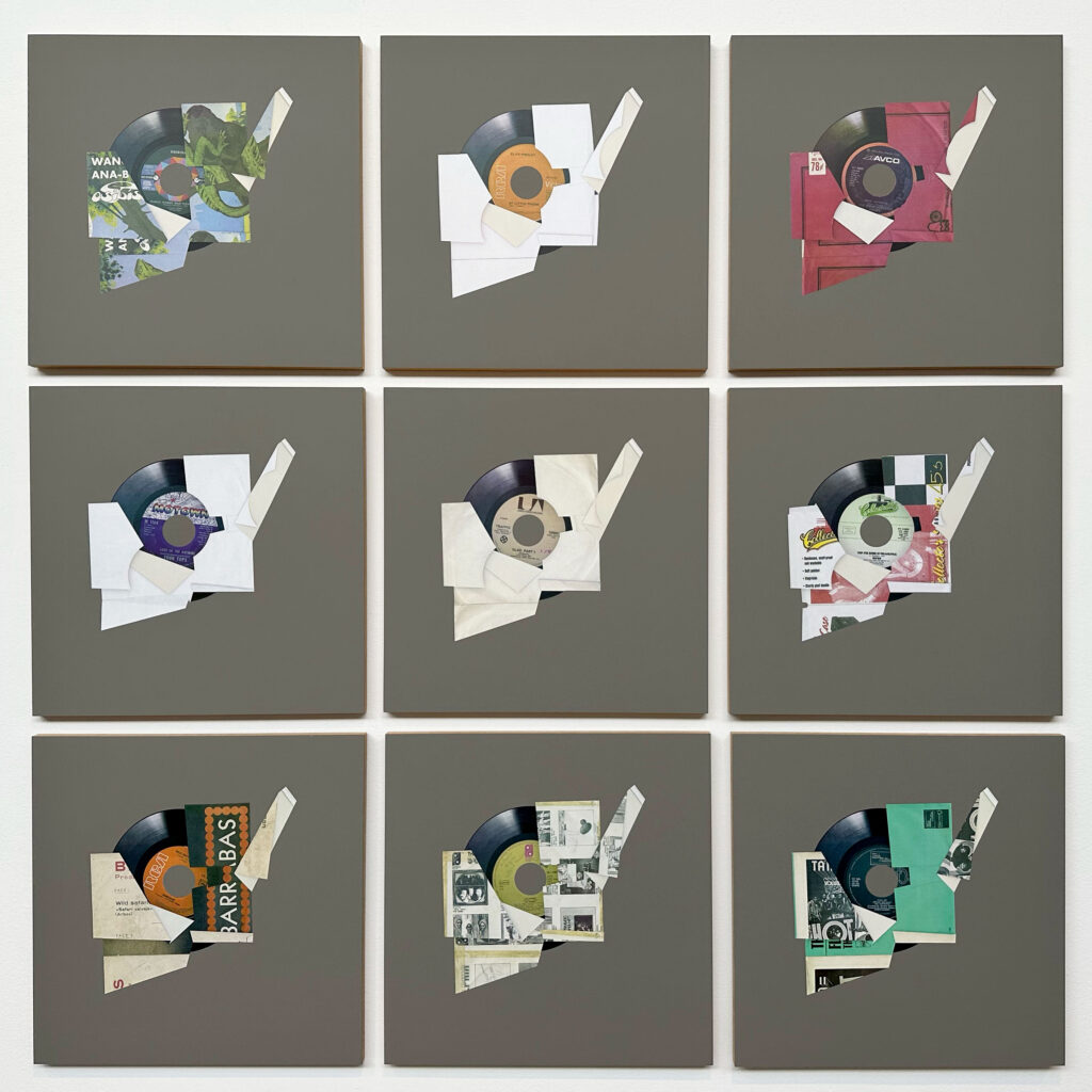
Kelley Walker, “Pioneer PL-518 7-inch Series Love (Is The Answer)” (2015), Pantone 4-color process silkscreen with acrylic ink on MDF

The work above is Kelley Walker’s Pioneer PL-518 7-inch Series Love (Is The Answer) (2015) from the exhibition Terry Adkins, Christian Marclay, Kelley Walker, that was on view at Paula Cooper Gallery in NYC this past March.

From the gallery about Kelley Walker-

Known for his manipulation of long-circulating images from advertising and other sources, Kelley Walker examines the consumption of visual culture using collage, screen-printing, sculpture, and installation. Bose Glitter Stock (2016) and Untitled (Screen to Screen) (2017) contain montages of superimposed silkscreen images printed on polyester mesh substrate, the armature for screen printing. Pioneer PL-518 7-inch Series Love (Is The Answer) (2015) is a grid of silkscreened panels that reproduce vinyl records and their packaging. Walker referenced the legendary Pioneer brand of turntables, famously advertised by Andy Warhol, as part of his investigation into the visual culture of the 1970s and 1980s New York disco scene.

Below is the song that the title references. It is included among the records pictured and is from the Four Tops album, Still Waters Run Deep.

Four Tops- Love (Is The Answer)