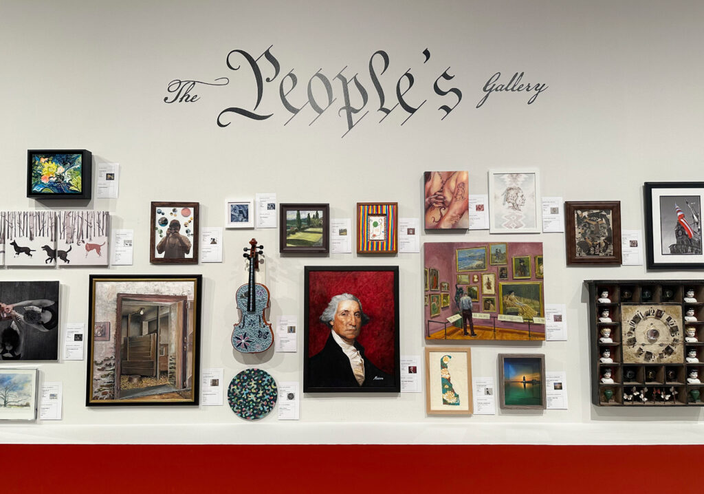
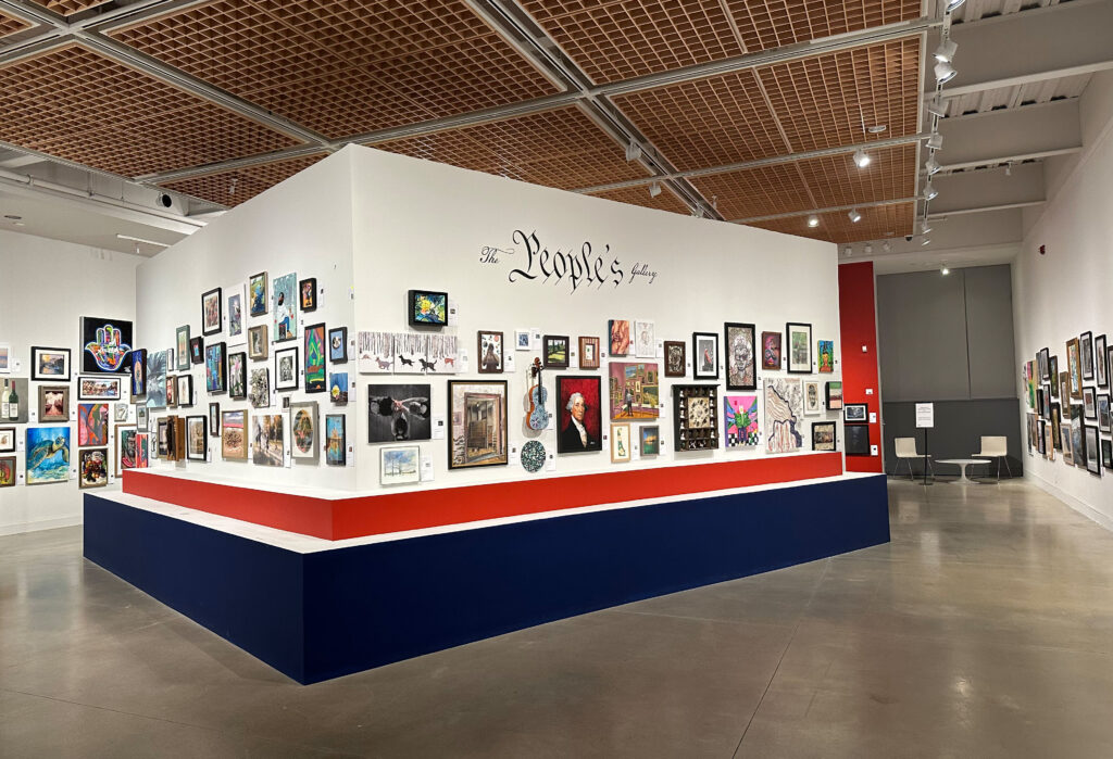
As part of their programming for the nation’s 250th birthday, Delaware Art Museum is showing the work of local artists in their current exhibition, The People’s Gallery. It is a non-juried exhibition which allowed artists at all levels to contribute work.
It’s a fantastic opportunity to see what this community of artists has created and to purchase local art. Check it out before it closes on 9/6/26.
Clockwise from top left: William Davidson White, “Children in the Tree”,1934; Michael J. Gallagher, “A Man’s Job”, c.1933-1934; Philip N. Yates, “Broken Nets”, 1934; Walter Willoughby, “Winter Landscape”, c. 1933-1934
Helen Farr Sloan, “W.P.A. Theater”c.1935, Oil on board. It depicts a Federal Theater production during the Depression in NYC’s Washington Square Park. These productions were often free or heavily discounted.
At a time when government arts funding and jobs programs are needed more than ever, Citizen Artist at Delaware Art Museum reminds visitors of the positive and long lasting impact of two past initiatives- The New Deal in the 1930s and 1940s, and the Comprehensive Employment and Training Act of 1973 (CETA). Featuring artwork created during these both of these time periods, the exhibition also highlights the important contributions made by artists in their communities.
From the museum about the exhibition:
Citizen Artist highlights diverse artists working for America during 1930s and 1940s Depression-era programs and federally funded initiatives of the 1970s. The New Deal and the Comprehensive Employment and Training Act were catalysts in Delaware and across the nation as economic relief programs amplified the arts, creating new possibilities for creative employment. This exhibition centers artists as historians, storytellers, and visionaries during the Semiquincentennial.
Through the Comprehensive Employment and Training Act of 1973 (CETA), the Department of Labor supported a nation’s worth of art programs on a scale not seen since the conclusion of the New Deal in 1943. Those New Deal artists that outlived the Federal Art Project never forgot the significance of their work for the public, and they took that knowledge to the classrooms and administrative offices where they carried out the rest of their careers. CETA was designed as a jobs program, not an arts program, but Title VI of the legislation funded opportunities for the cyclically unemployed —artists—in public service roles. When CETA arrived in the 1970s, artists and their allies across the nation quickly understood its potential in the context of the legacy of the New Deal.
Citizen Artist is a story about reciprocal support between artists and communities. The exhibition celebrates artists who found lasting success through their participation in fine art programs like the Public Works of Art Project and CETA-funded contemporary art spaces. We also honor the public service work undertaken by tens of thousands of New Deal and CETA-funded artists, especially the painters, puppeteers, and photographers who produced educational resources and performances for children across the nation. Citizen Artist looks back at the intertwined histories of CETA and the New Deal to elevate how artists can and do support the public. By working in graphics offices, writers’ programs, and darkrooms, New Deal and CETA artists created and transformed the physical and cultural infrastructure of the United States.
Included within Citizen Artist is Citizen Photographer, an exhibition of images created by Delaware photographers for the U.S.’s 250th anniversary.
From the museum about Citizen Photographer:
What does it mean to be a Delawarean at the nation’s 250th anniversary? The Delaware Art Museum, collaborating with Wilmington’s Teen Warehouse, the Smyrna Opera House, and the Lewes Public Library, invited residents across the state to engage in civic reflection and contribute to shaping public perceptions of identity through photography. Citizen Photographer is inspired by the federally funded initiatives of the past, such as the Farm Security Administration and the Comprehensive Employment and Training Act. These were times when documenting the nation and the many people who called it home was an earnest endeavor, the means to understand and appreciate our individuality, humanity, and common needs.
At the United States 250th anniversary in 2026, this project offers multiple ways for Delawareans to engage as learners, artists, and citizens contributing to the state’s shared story. Photographers Morris Brown II, B. Proud, and Andre’ Wright, Jr. led workshops across the state and selected the 24 photographs on view. For Wright, Jr., Citizen Photographer is “about perspective, voices, and the stories people choose to tell about where they come from.” Proud reflects how local photographers “captured the many facets of Delaware, from its cities to its farmlands, from its people to its landscapes, revealing why the state truly lives up to one of its nicknames, ‘Small Wonder.'” Morris invites us to “take the time to treasure each photograph and to experience each Delaware love story on exhibit.”
Justine Kelley is a Filipino-American, Philadelphia-based printmaker, illustrator, and designer. She is inspired by vibrant colors, emotions, and the accidents that happen during the art-making process. Most of Kelley’s work is hand-drawn, infusing it with an honest, intimate quality. Her illustrations aim to explore the social barriers that exist between people to create new structures of meaning and connectivity. Kelley likens her art-making process to cooking—she uses the resources she has to feed the people she loves. Her goal is to synthesize emotion as a raw material and use it to create a magic funhouse mirror which reflects the world back at itself.
For her exhibition at Philadelphia International Airport, Kelley presents the Bella Vista neighborhood with an emphasis on the Italian Market, the nation’s oldest open-air market which spans 20 city blocks in South Philly. Bella Vista means “Beautiful Sight” in Italian. For many generations, this neighborhood has been home to a variety of immigrant communities, from Irish, Italian, and African descendants in the 1800s to Vietnamese, Korean, Cambodian, and Mexican communities settling in the 1900s. Having recently moved to South Philly, Kelley says, “I wanted to celebrate the abundance of food and fresh produce, colorful signage and typography, and bustling community that exist in the Italian Market and Bella Vista area, with much thanks to the shopkeepers who run their businesses and the neighbors who live here… If the path to one’s heart is through the stomach, then this place is an artery pumping vitality to the city, feeding us with nutritious foods and delicious sights. It’s a feast for all the senses. If I were to rename Bella Vista, it would be the Italian words for “Beautiful Sights, Sounds, Tastes, Smells, and Feelings”.
Currently on view at Philadelphia International Airport,It’s A Wrap 2, brightens a section of the airport with art work and installations by several local artists.
This exhibition features work by Philadelphia area artists who were invited to create unique architectural interventions within the Airport terminal. Using yarn, fabric, felt, found objects, tape, paint, wheat paste, and wood, the artists applied their work to the ceiling tiles, columns, rockers, walls, walkway, and windows. They have visually transformed this location into an immersive and experiential art-filled passageway.
The artists responded to the existing architectural elements to create an unexpected visual experience and an engaging space for people to pass through. It is a form of urban interventionism where art activates the built environment with the intention to see a public space in a new and creative way.
Corita Kent (Sister Mary Corita)’s print I Should Like to Be Able to Love My Country and Still Love Justice, 1968, was on view at the Museum of Modern Art in NYC in June of 2024.
From the museum about the artist-
Corita Kent, also known in the Catholic Church as Sister Mary Corita, incorporated a range of references into her silkscreen prints, spanning pop culture imagery and song lyrics, biblical allusions, and literary conceits. After seeing Andy Warhol’s Campbell’s Soup Cans in 1962, she was inspired to embrace the language of Pop art, using bold, graphic designs to convey anti-war messages. In the 1980s Kent’s posters and ephemera were collected by PAD/D (Political Art Documentation/Distribution), a New York-based art activism group with a mission to create an archive of politically concerned art and ephemera from around the world. The materials are now part of the MoMA Archives, Library, and Research Collections.
You can currently see some of her photographic archive at Marciano Art Foundation in Los Angeles for the exhibition Corita Kent: The Sorcery of Images, on view until 1/24/26. The show “focuses on a little seen part of Corita’s artistic practice: her archive of over fifteen thousand 35 mm slides that she and her cohorts took between 1955 and 1968 while she was a beloved teacher in the art department at Immaculate Heart College”.
As part of their press release they include this lovely quote from the artist-
“In a sense, the whole world around the artist is his source, his sorting and relating powers are his sorcery, and the one isn’t much good without the other. … Anything can be a source, even a mistake. The sorcery or the thievery is the art of relating sources into a new solution.”
Her work can also be seen in Los Angeles at the Corita Art Center. The center is free to visit on Saturdays (with appointment).
Delaware Art Museum is currently showing an impressive collection of prints from a variety of artists for Marisol to Warhol: Printmaking and Creative Collaboration.
From the museum about the exhibition-
Marisol to Warhol: Printmaking and Creative Collaboration, brings together more than a dozen portfolios and suites in DelArt’s collection. The featured prints showcase the creative collaboration of artists who experiment across media. The exhibition presents a who’s who of American artists working in the second half of the 20th century, including Marisol, William Majors, Jacob Lawrence, Andy Warhol, Audrey Flack, Robert Blackburn, Ben Sakoguchi, Lorna Simpson, Lowell Nesbitt, and Luis Jiménez. Produced by individuals and print shops, these groups of prints functioned as tools for commemoration, fundraising, and political awareness in a range of techniques, styles and intentions.
Joining the exhibition is a special loan from Art Bridges, William T. Williams’ painting Walter’s Advice from 1970. Produced the same year as a newly acquired print portfolio by Williams, Walter’s Advice employs similar forms and colors. The two are displayed together to showcase an artist’s creative exploration across media and the collaborative aspect of printmaking.
Below are a few more selections-
Pages from Dead Birds, a book which combined poetry by Christopher Erb with prints by 24 artists.
From the museum-
Dead Birds pairs poetry by Christopher Erb with prints by 24 artists, demonstrating the vibrant artistic community around the poet and his wife Elena Laza, a printer, designer, and typographer. Erb penned the poems and sent them to artists who used them as inspiration for their prints. Once the prints were produced, Laza typeset and printed the text using a turn-of-the-century press and created boxes to house the prints.
Several of the collaborating artists were affiliated with Robert Blackburn’s Printmaking Workshop and the Center for Book Arts in New York, where Erb and Laza exhibited. Others worked and studied at the Art Students League of New York and were introduced to the project through Will Barnet, a master printer and longtime instructor at the League. Dead Birds was among Erb’s most ambitious and collaborative projects.
Above are four prints from Lowell Nesbitt‘s Moon Shot print series.
From the museum-
Lowell Nesbitt produced this suite of prints, published by the Palley Gallery, following his participation in NASA’s Artist Cooperation Program. Artists working for NASA had behind-the-scenes access to witness events like launches and splashdowns up close and in person. For this series, though, Nesbitt reproduces photographs of the one place NASA can’t let him go: the Moon.
Nesbitt is often associated with Photorealism, but these prints take evocative liberties with their approach to depicting the Moon. Bolstered by quotes from astronauts, Nesbitt meditates on the visual experience of seeing the Moon up close and undistorted by the Earth’s atmosphere. The cratered surface appears in shimmering gestural whorls against the black paper-an appropriate stand-in for the unpigmented vacuum of outer space. Nesbitt’s portfolio considers space exploration alongside his printmaking process. One lithograph showing the footprint of an astronaut’s boot pressed into the lunar soil seems to reference the lithographic process itself.
Upstairs in a separate section are prints from Salvador Dalí’s playing card series, seen below.
From the museum-
In 1967 and 1969, Salvador Dali designed a set of playing cards for the renowned French printing house Draeger Freés. Several years later, the artist revisited the project and created a series of 17 designs featuring an ace, jack, queen, king, and joker in each suit. The art dealer Reese Palley later published the 250-print edition with the goal of selling individual prints at an elaborate, 50th birthday party in Paris. The sales scheme, and the chartered Pan American flights from Atlantic City to the event, were widely covered in national press in January 1972. Both the original cards and the prints that followed feature Dali’s surreal motifs and reference many of his most famous paintings.
The game begins with a truck driver named Conway arriving at a highway gas station with his dog. He is having trouble finding the address he was given for his delivery. From there you travel with him over various roads, an underground highway, and eventually even by boat. Along the way you stop at museums, an abandoned mine, local bars, an odd office building, a cave filled with bats, and more while meeting several of the area’s residents. You can choose to learn more about the characters and often join them to explore locations. The story unfolds with no sense of urgency and you are often given the choice to move on or to stay and explore further.
Filled with magical realist elements, it is often a world that can still feel depressingly familiar. Most of the characters are struggling in some way with the effects a failing economy, something that feels even more relevant since 2020. But there are also glimmers of hope in the ways the characters show up for each other- adapting, creating, and forming communities.
Below are a few selections from the game’s interludes that provide engaging breaks from the main story.
Scenes from The Entertainment– a play directed by one of the characters-
One of the phones from Here and There Along The Echo– you dial the number and the character Will (played by musician Will Oldham) reads information from the Echo River’s Bureau of Secret Tourism.
Scenes from Un Pueblo De Nada take place at the public access station- you can also find a live action version here.
Kentucky Route Zero is a game that stays with you long after it finishes. There are lots of things to discover and it’s worth playing more than once to find them. The website Highway Zero is good for things you may have missed.
The game is available for purchase on their website and can also currently be found on Netflix.
Below are a selection of works from the artists and their statements about their work.
Moones Zeydabadi
Moones Zeydabadi
I make drawings and paintings depicting human and nonhuman figures in scenes of intimate encounter with each other and their environments. These narratives draw from deeply personal experiences which embody a more universal experience of being. I weave together fragments of recollection, imagined environments, and symbolic gestures to visually represent the complexity of identity and the way it shifts and fractures into new territories as one journeys through life.
My practice explores the liminal territory in which identity, memory and legacy seep through our collective subconsciousness. Through my interest in casting light on overlooked or forgotten stories, I infuse them with living qualities and complex non-linear narrative paths, I model a new, broader, and alternative space of belonging.
Foreground sculptures by Priya Dave
Detail from the interior of one sculpture by Priya Dave
Priya Dave
As an Indian, my art spectrum seeks to disrupt the cycle of disempowerment by integrating self-studied neuroscience research to explore the microbiology of the mind affected by culturally restrictive and arbitrary rules. The societal norms often resulted in mental health challenges, including depression and self-doubt, which left many struggling to trust their judgment or make decisions. Through my work, I strive to create immersive environments that map the brain’s physiological structure, fostering public engagement and raising awareness about mental health through a scientific and artistic lens.
My artistic practice encompasses various mediums, including painting, drawing, printmaking, immersive and video installations, and multi-sensorial experiences. Drawing from my Indian heritage, l often incorporate culturally and historically significant materials like kumkum, fabrics, and spices. These elements are deeply rooted in tradition and carry themes of memory, and identity. By transforming these materials into multisensory artworks, I reimagine their traditional meanings and bring them into contemporary conversations.
Through this fusion of culture and neuroscience, I create spaces that stimulate multiple senses, including sight, touch, sound, smell, and proprioception, encouraging deeper introspection. My work seeks to bridge the gap between personal experience and universal understanding, addressing the amalgamation of mental health, identity, and sensory perception. It is a reflection of my commitment to exploring how art can transcend cultural boundaries and inspire meaningful connections while fostering mental well- being and self-awareness.
Paintings by Abigail Dudley
Abigail Dudley
My paintings celebrate the singularity of perception and the way it entangles how one perceives the world. I am captivated by the slow build-up of forms and the subtle shifts in color that allow me to infuse a soft atmosphere of memory and temporal transitions into my paintings. My work is connected by my search for meaningful encounters with my surroundings through the act of painting, and a search to find surprising moments in life and painting.
My work focuses on the visual slippage between personal narrative and creating a space between harmony and contradictions of visual elements. Through this process, I tie together a space through intimate moments of perception. I aim to cultivate the idea of what it means to linger within a place and how that response can translate into a painting to act as a form of resistance to fast-looking in a culture that values a fast pace of life.
Work by Mikhail Shulga
Mikhail Shulga
My introspective nature is rooted in my identity as a Russian. Long winters and limited sunlight compel us to seek solace indoors, fostering a culture of deep spiritualism and reflection. Over generations, resilience has emerged from the hardships, shifting political regimes, and wars that define our history, further shaping this introspective tradition.
In my installations, I repurpose discarded electronics – objects imbued with nostalgia and unrealized promise. Once luxurious and cutting-edge, these items now lie abandoned on sidewalks. Many come from the ’90s and ’00s, my childhood years, when such technology symbolized hope for a better future. But that promise feels unfulfilled. While our lives have become more convenient, we are left grappling with existential questions: How does technology impact our sense of self and the meaning of human existence? Does the rapid advancement of technology amplify or diminish alienation, freedom, and authenticity? How do virtual spaces, social media, and digital communication shape our perceptions of reality, relationships, and identity? Perhaps the answers lie not in outside but in our own reflections. – “We don’t know what to do with other worlds. We don’t need other worlds. We need a mirror.” Tarkovsky, A. (Director). (1972), Solaris [Film].
Work by Emmanuel Aboagye
Emmanuel Aboagye
My work uses the language of painting to explore ideas of visibility and invisibility as it relates to issues of identity, memory and belonging in a post-colonial context. I explore the complexities of identity, be it class, race and nationality. I give agency to memory not as a tool to investigate the past but a medium for evaluation in the present. I investigate the nuances and specificity of the idea of belonging.
Having been trained as a painter, I employ modern sensibilities in engaging the materials I work with, utilizing them as a lens to examine notions of liberation. I work with materials like, acrylic paint, oil paint, brush, linen, canvas, sequence, wrappers, frost sheet, junk mail flyers, patterned plastic bags and electric iron. I consider the histories and attitude of the materials I work with. They are not merely tools but collaborators in an emancipatory process.
I lean on improvisation as a radical approach for self-liberation in my practice. This allows for spontaneity, fluidity, and the unexpected, reflecting my commitment to embracing uncertainty and possibility.
Paintings by Arend Neyhouse
Arend Neyhouse
My work weaves historical notions of art into the tapestry of our contemporary world. Specifically, while dealing with elements of myth and fable, I tell stories in the space of suburban America. As a consumer of fiction, and spending the majority of my life in suburbia, I explore the synthesis of these elements. My work exists at the crossroads of fable and familiar.
With my figurative paintings, I continue to explore realist arts position in the contemporary art world. I think that through the exploration of the mundane parts of our daily lives lies a time capsule for posterity – a captivating exploration of quietude transformed into an everlasting narrative.
My images exist in the in between. Moments before or after a great change. I am not trying to tell the whole story, but merely a single page, or even a single line; leaving whole worlds both before and after each image. A testament to the sense of sonder as the world churns around us.
Creating epic scenes through my technical approach and unwavering craftsmanship; humanity is laid bare. Through my art, I aspire to create not just paintings, but windows into the soul of our shared existence.
Head to the next page to see more of the artists from the show.
ArtFields Community Mural by Jessica Diaz, Morgan Funkhouser, Olivia Cramer, Sam Ogden
Today’s flashback is to 2021 and a trip to Lake City, South Carolina to check out ArtFields. Started in 2013, the event is a wonderful example of how the arts can revitalize local economies.
So what is ArtFields? Every year for one week local businesses and galleries host works created by artists from the Southeastern United States for a competition with prizes totaling over $145,000. There are also two People’s Choice Awards which are determined by the attendees of the festival. The other awards are chosen by a panel of art professionals. Special events take place throughout the week and ArtFields Jr. offers a chance to see work by South Carolina students.
This year the event runs from April 25th to May 3rd, 2025. Even if you can’t make it, it’s worth taking a look here at this year’s artwork as well as from past years.
“There may be as few as only 7 red wolves remaining in the wild. These animals, like so many others, are disappearing in the shadows of our periphery. Their very existence depends on us, as did their extinction. Let us see them, acknowledge them, acknowledge that biodiversity and the balance of life matters. They are painted bright red in order to stand out and bring attention, no longer hidden away.”
Pictured above is The House on Church Street which in 2021 was used for several art installations including the two below. The first is New Histories: The Gadsden Farm Project by Michael Austin Diaz and Holly Hanessian.
About the installation-
New Histories: The Gadsden Farm Project is a socially engaged art project that explores the new history of the Gadsden County, FL. Once a thriving agriculturally center, the county is now the poorest in the state of Florida and the only county with a majority African American population. Working with a team from the State of Florida Archives, we were able to build relationships with over a dozen small farmers trying to address the area’s status as an economic and food desert. These farmers included first generation immigrants, fourth generation shade tobacco farmers, livestock farmers, and organic vegetable growers. The project is presented here through a dining table installation. Embedded speakers play a series of interviews with participating farmers, and each farmer is represented through an individually designed ceramic dinner. The table is set with live plants, seed bombs, and alfalfa hay.
The installation below, All Too Brief, was created by Gainesville, Florida artist Cindy Steiler.
From the ArtFields website about the installation-
All Too Brief was inspired by the movement of time and the unconscious process where our present moment is being continuously converted to memory. The elements comprising All Too Brief include a series of scrolls of cyanotype photographs and repurposed textiles wound on antique industrial weaving bobbins. Each scroll has a WW2-era laundry pin embossed with a number that corresponds to the written narrative of the images and textiles it holds. This piece is my attempt to document and archive people, places, and fleeting moments I hold dear. This piece became even more meaningful to me this year. My studio assistant at the time this piece was created has since passed.
Artist and illustrator Joseph Christian Leyendecker created this painting in 1926 for the cover of The Saturday Evening Post. Leyendecker produced annual covers featuring timely takes on “Baby New Year” for several years.
This work was part of Delaware Art Museum’s 2024 exhibition Jazz Age Illustration, which focused on the art of popular illustration in the United States between 1919 and 1942.