
This mural was created by German artist Case Maclaim for 2016’s Top to Bottom mural project- a group of murals covering a building in Long Island City organized by Arts Org NYC.

This mural was created by German artist Case Maclaim for 2016’s Top to Bottom mural project- a group of murals covering a building in Long Island City organized by Arts Org NYC.

What does a wall of color make you feel? Does that change if it exists in a gallery? What about the specific color? And if you add text?
These are some of the questions that arise when viewing Haim Steinbach’s mypoemisfinishedandIhaven’tmentionedorangeyet, 2019. The work was part of his 2019 exhibition Appear to Use at Tanya Bonakdar Gallery in Los Angeles.
From the press release-
Holding a wall of the back gallery is an expansive wall painting consisting of the color orange along with the line—mypoemisfinishedandIhaven’tmentionedorangeyet—from the poem “Why I Am Not a Painter” by Frank O’Hara. Here, Steinbach challenges our perception of architecture in the relationship between language, color and cultural structures, encompassing the core themes of the exhibition.
Here is the Frank O’Hara poem being referenced-
I am not a painter, I am a poet.
Why? I think I would rather be
a painter, but I am not. Well,
for instance, Mike Goldberg
is starting a painting. I drop in.
“Sit down and have a drink” he
says. I drink; we drink. I look
up. “You have SARDINES in it.”
“Yes, it needed something there.”
“Oh.” I go and the days go by
and I drop in again. The painting
is going on, and I go, and the days
go by. I drop in. The painting is
finished. “Where’s SARDINES?”
All that’s left is just
letters, “It was too much,” Mike says.
But me? One day I am thinking of
a color: orange. I write a line
about orange. Pretty soon it is a
whole page of words, not lines.
Then another page. There should be
so much more, not of orange, of
words, of how terrible orange is
and life. Days go by. It is even in
prose, I am a real poet. My poem
is finished and I haven’t mentioned
orange yet. It’s twelve poems, I call
it ORANGES. And one day in a gallery
I see Mike’s painting, called SARDINES.
And below is Michael Goldberg’s Sardines.

Michael Goldberg, “Sardines”, 1955, oil and adhesive tape on canvas, image via Smithsonian American Art Museum

It was Andy Warhol’s birthday this past Tuesday, August 6th, so today seemed like a good time to post some images taken at The Andy Warhol Museum in Pittsburgh. Warhol was a prolific artist and the museum does an excellent job at presenting both his body of work, and the essence of what made him such a unique presence in the world.
Below are a few selections from what was on view in February of 2024.

Warhol made several film works including Screen Tests, his series of portraits in which the subjects attempted to remain still for around three minutes. The results were then played back in slow motion. Many well known names participated.

The museum has a room dedicated to their recreation of his delightful installation Silver Clouds.
From the museum about this work-
“I don’t paint anymore, I gave it up about a year ago and just do movies now. I could do two things at the same time but movies are more exciting. Painting was just a phase I went through. But I’m doing some floating sculpture now: silver rectangles that I blow up and that float.”
—Andy Warhol, 1966
In April 1966 Warhol opened his light and music extravaganza the Exploding Plastic Inevitable (EPI), a complete sensorial experience of light, music, and film at the Dom, a large dance hall in the East Village in New York City. Running concurrently with the EPI was Warhol’s bold and unconventional exhibition at the prestigious Leo Castelli Gallery that comprised two artworks: the Silver Clouds and Cow Wallpaper.
Constructed from metalized plastic film and filled with helium, the floating clouds were produced in collaboration with Billy Klüver, an engineer known for his work with artists such as Robert Rauschenberg, Yvonne Rainer, and John Cage. Warhol originally asked Klüver to create floating light bulbs; an unusual shape that proved infeasible.
Klüver showed Warhol a sample of the silver material and his reaction to the plastic sparked a new direction, “Let’s make clouds.” They experimented with cumulus shapes, but the puffed rectangle was the most successful and most buoyant. The end result was w hat Warhol was looking for from the beginning— “paintings that could float.” Silver Clouds, like the EPI with its flashing lights and overlapping films, was an explosion of objects in space and presented an immersive, bodily experience for the viewer.


Warhol was always experimenting with new ideas and processes. Pictured above is Oxidation, 1978, and a closer look at the canvas. It is part of Altered States, an exhibition of this body of work and its creation.
Below the museum explains Warhol’s process, and how the paintings were altered both during past exhibitions, and again when the museum lost power and climate control.
Andy Warhol’s Oxidation paintings represent the artist’s radical approach to Abstract Expressionism, a movement popularized by painters like Jackson Pollock and Mark Rothko after World War II, and a style Warhol didn’t experiment with until late in his career. Between 1977 and 1978, however, when Warhol began testing the corrosive effects of oxidation by mixing copper paint and urine, the beautifully iridescent canvases were a critical breakthrough at a time when his standing in the art world had taken a hit. The Oxidation series, along with abstract works like the Rorschachs and Shadows, allowed Warhol to reinvent himself yet again.
To create the Oxidation works, Warhol and his assistants mixed dry metallic powder in water before adding acrylic medium as the binder.
Canvases were spread out on the studio floor and coated in copper paint. Warhol’s assistants or Factory visitors were then invited to urinate on the canvases while the paint was still wet. As the urine acid oxidized the metal in the copper paint, a range of unpredictable patterns emerged.
Before Warhol’s death in 1987, the Oxidation paintings were exhibited only three times, including the Paris Art Fair FIAC at the Grand Palais, where the artist first noticed the volatility of the works. “When I showed them in Paris, the hot lights made them melt again,” he said.
“It’s very weird.. they never stopped dripping.” More than 45 years later, unpredictability remains a hallmark of the series. In June of 2020, after a power outage disabled the museum’s climate control for several days, staff conservators noticed changes similar to what Warhol observed in Paris. New drips appeared on the surface of Oxidation (1978), shown here, and the areas of corrosion changed color.
This presentation seeks to answer a deceptively simple question:
What happened? Museum conservators, with help from colleagues in the field and scientists, have been hard at work finding answers. The examination and analysis of the Oxidation paintings in the museum’s collection will contribute to proper stewardship, preservation, and treatment of the nearly 100 other works worldwide.

Several of the paintings on view are in his signature style, including his portraits of famous (and less famous) people, and in one room, different skulls in various colors.
From the museum-
Warhol’s Skull paintings have often been considered memento mori, recalling the centuries-long tradition of art that reminds us of our mortality. Memento mori, from Latin, translates roughly to “remember that you are mortal” or “remember you will die.” Warhol’s own near-death experience happened in 1968, when troubled writer Valerie Solanas shot Warhol in the abdomen after claiming the artist had lost a script she had written. After reportedly being declared dead upon arrival at the hospital, Warhol’s life was saved during five hours of surgery. After nearly two months, he was released from the hospital but required further surgeries over the following years.
On one of the floors is The Archives Study Center. There, behind glass, are some of Warhol’s Time Capsules- boxes he filled with a wide variety of items, sealed and put into storage.


On the same floor is the Great Dane pictured above, Champion Ador Tipp Topp (“Cecil”), who Warhol bought at an antique store after being told the dog had belonged to Cecil B. De Mille. The dog remained in Warhol’s office until his death.
A little more detail from the museum-
This mounted Great Dane, called Cecil by Warhol and his associates, was once a champion show dog. Born in Germany in 1921, original name was Ador Tipp Topp. Owned by Charles Ludwig, a top breeder, Cecil was sold to Gerdus H. Wynkoop of Long Island who entered the dog in several shows earning him the title of Champion by 1924, and Best of Breed at the Westminster Kennel Club.
After his death in 1930, Cecil’s remains were sent to Yale University in Connecticut, where they were mounted and displayed with 11 other breeds in what was known colloquially as “the dog hall of fame” at the Peabody Museum. However, by 1945, the canine display was removed to storage and forgotten.
In 1964 Scott Elliot, a Yale drama student, went to the Museum to find birds for a new play. He found the birds and also bought all 12 dog mounts for $10 each. When Elliot had to move a few months later, many of the mounts were left with a friend who put them in rented storage, which went unpaid and the contents were dispersed.
Warhol came across the display in an antique shop on 3rd Avenue several years later. He was told that the dog had belonged to film director Cecil B. DeMille. Warhol bought the story and the Great Dane for $300. Cecil found his final home at Andy’s office, where he was kept until Andy’s death in 1986.
Cecil’s current appearance differs from his championship form. His coat was originally black and white but exposure to sunlight has faded it to brown. Over the years, it sustained damage to the ears; they were repaired in April 1994 in anticipation of the opening of the Warhol Museum, to reflect the style of current breeds.
This is just a brief selection of what was on view. The museum collection also includes his early commercial paintings, some of his collaborations, television work, and more.
One of the great things about Andy Warhol is that no matter how much you know, there are always new things to learn. Even more than thirty years after his death, he remains as relevant as ever.

The above image is of Jessie Homer French’s Mapestry California 2012, 2012 (fabric, thread, fabric paint, and pen), which was on view in 2018 at Palm Springs Art Museum.
From the museum about the work-
This work is from a series of “mapestries” that the artist made between 2012-2017. These textile works graphically map out natural elements and forces in California, from prominent flora and fauna, natural monuments and mountain ranges, as well as hidden fault lines that spur the earthquakes that constantly threaten the region and its inhabitants. The work reflects the artist’s hyperawareness of the environment around her. Their flat, graphic qualities are similar in form to the artist’s paintings. The mapestries were made specifically for Californians, as artworks that could do no harm hanging over one’s bed in case of an earthquake.
One of her paintings is currently part of the benefit exhibition Art for a Safe and Healthy California at Gagosian Beverly Hills. The exhibition, presented by Jane Fonda, along with the gallery, is raising money to protect communities from toxic oil drilling.

The painting above is 3 Oracles, 2022, by Sayre Gomez, on view at Columbus Museum of Art. It is part of the exhibition New Encounters: Reframing the Contemporary Collection of the Columbus Museum of Art .
From the museum about the work-
Based in Los Angeles, Sayre Gomez often employs techniques borrowed from Hollywood set painting and commercial advertising to heighten the sense of lifelikeness in his paintings. In 3 Oracles, Gomez’s depiction of a vacant big-box store renders the shifting forces of the consumer economy in exacting, photo-realistic detail. The three appliance brands represented on the store’s façade, DieHard, Craftsman, and Kenmore, were all formerly owned by Sears Corporation, a retail giant that filed for bankruptcy in 2018.
Gomez recently co-curated the Feed the Streets Benefit Show at Sebastian Gladstone in Los Angeles. The opening is tomorrow evening (7/13) from 6-9pm and the exhibition will be on view until 8/3/24.
The group exhibition includes work by- Alfonso Gonzalez Jr. , Andrew Park, Bennet Schlesinger, Bryan Ruiz, Calvin Marcus, Chad Murray, Eddie Martinez, Emma McMillan, Evan Holloway, Greg Ito, G.V. Rodriguez, Jaime Muñoz, Jake Longstreth, Jonas Wood, Josh Smith, JPW3, Julia Yerger, Juliana Halpert, Justin Caguiat, Kalan Strauss, Mario Ayala, Max Hooper Schneider, Mungo Thomson, Nick Angelo, Nick Clark, Nihura Montiel, Richard Tinkler, Ryan Preciado, Sam Moyer, Sayre Gomez, Sterling Ruby, timo fahler, and Tristan Unrau.
All proceeds benefit Feed the Streets and their ongoing mission of colecting donated food, hygiene products, clothing, and educational items for hand to hand distribution in Los Angeles and New York. Feed the Streets also provides athletic and creative resources for underserved youth.

“Pale Rider”, 2019, Oil on canvas
The large painting above is from Srijohn Chowdhury’s 2019 exhibition, A Divine Dance, at Anat Ebgi in Los Angeles.
From the gallery-
Srijon Chowdhury’s paintings are characterized by moody symbolist compositions of richly colored floral and domestic settings. He conjures poetic and allegorical narratives through the use of myth, memory, and repetition.
Pale Rider, the largest painting in the exhibition, depicts an angelic woman with flowing hair riding horseback; its monumental scale envelopes viewers in a mystical narrative. The rider appears translucent and wields a scythe as she moves across a meadow of blooming flowers—an allusion to death and birth. In the foreground, there is a fence composed from a poem by William Blake titled “A Divine Image” that Chowdhury has turned into a sigil—an ancient practice of transforming pictorial text into a symbol that is considered to have magical powers. The poem speaks about destructive abstracts of human nature: cruelty, jealousy, terror, and secrecy.
Chowdhury’s work confronts universal physical and emotional themes. Soft aura of moonlight, glow of flowers, and dancing flames invite quiet contemplation. He sensitively vacillates between despair and hopelessness at the human condition, while brightening at joy, beauty, and hope that like flowers, life will go on.
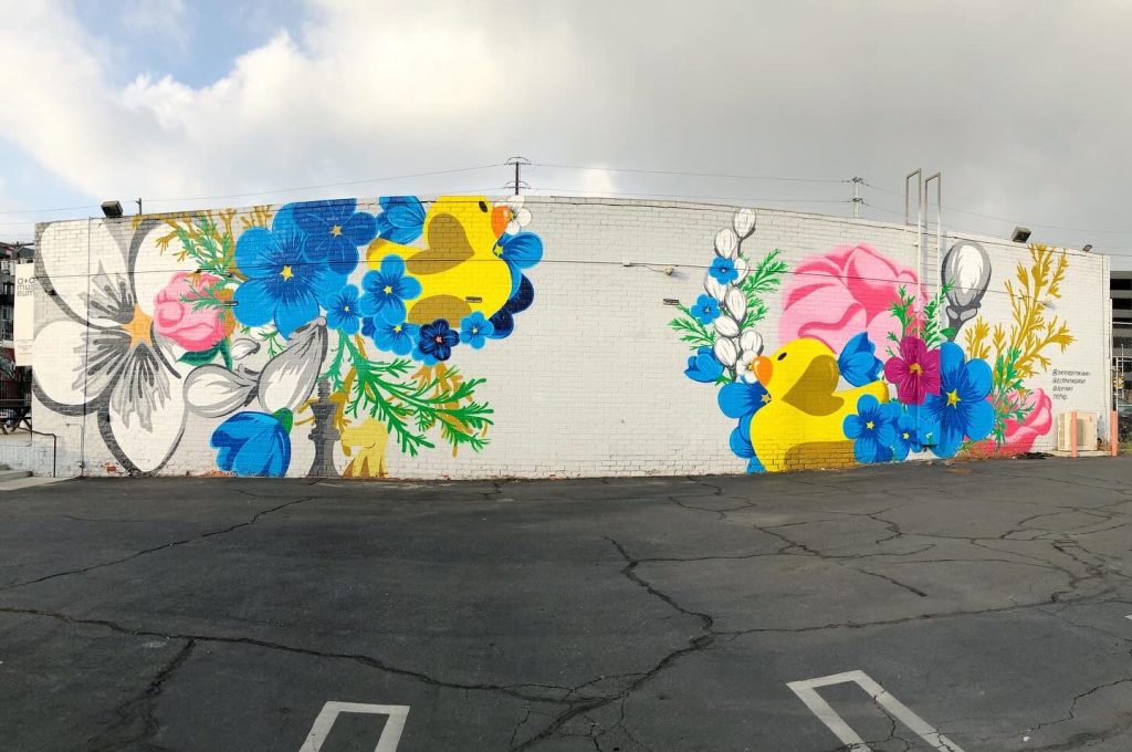

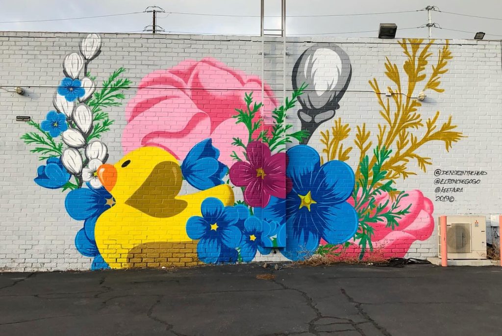
This mural, by @elpinchegogo, @denseinthehead, @keefaura, and @eder_one, was spotted in 2019 outside the A+D Museum in downtown Los Angeles.
Eder Cetina (eder_one) also runs Wilson Cetina Group, which has worked on numerous artistic projects for various organizations and museums.
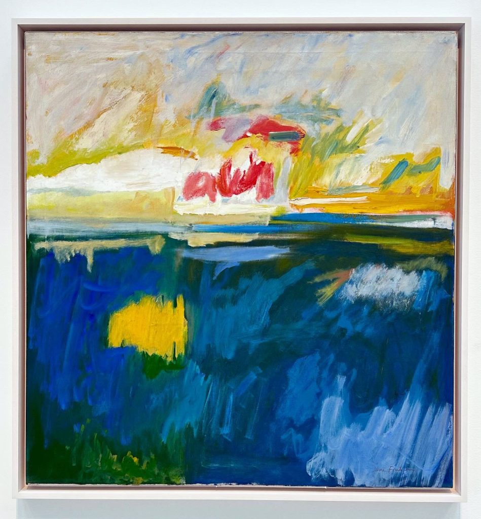
“Northern Lights”, 1959, oil on linen
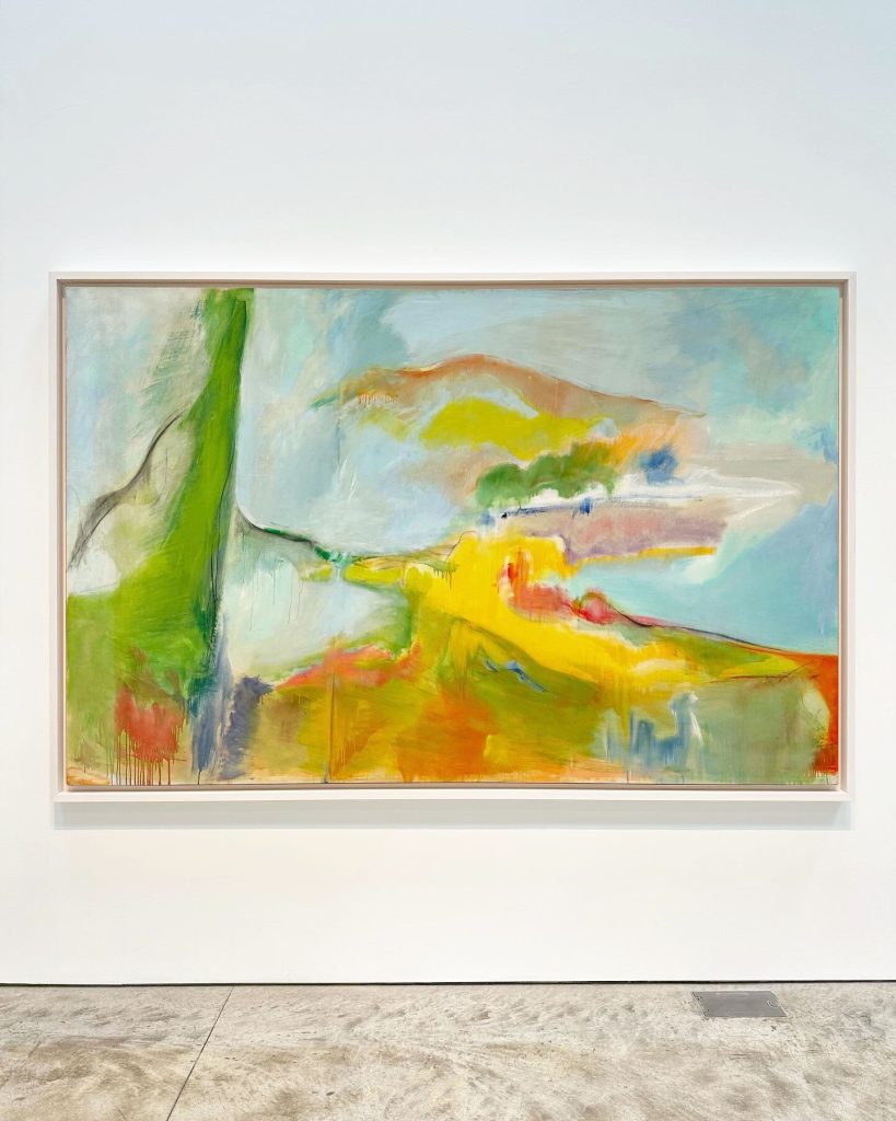
“Untitled (Near the Cove)”, c. 1958, oil on linen
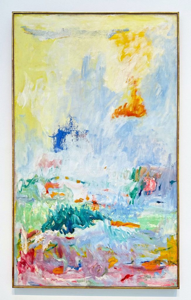
“Fresh Air”, c.1958-1962, oil on canvas
Although better known for her figurative paintings, Jane Freilicher also created several large abstract paintings which were on view last year at Kasmin gallery in NYC. The paintings hint at a recognizable landscape, but through her use of color and energetic brush strokes she evokes the feeling of being immersed in the beauty of nature- without the boundaries of a more realistic representation.
From the gallery about the work-
The exhibition presents a group of paintings in degrees of abstraction, realized by Freilicher between 1958 and 1962, a period of great inventiveness when the artist was spending stretches of time in Long Island but had yet to establish a studio there. The series marks a crucial moment of discovery and focus for Freilicher, who went on to integrate the freedom, fluidity, and confidence developed during this period into her more recognizable still lifes and landscapes of later decades.
Freilicher’s abstractions have their roots in observation, informed by her studies with legendary abstract painter Hans Hofmann at his schools in New York and Provincetown. In this group of paintings, pastoral landscapes from Water Mill, Long Island, are translated through the lens of the artist’s memory into confident gestural compositions defined by their use of color and sensitive depiction of light. In a 2006 interview for The New York Sun, the artist tells writer Jennifer Samet of this evolutionary moment in her practice: “I remember being overwhelmed by aqueous light and the obliteration of the horizon by fog.” Freilicher’s palette returns repeatedly here to a combination of off-white and light blue, rendered in loose brushwork across an expansive pictorial space to give a palpable impression of the airy, open landscape of the country.
Breaking out of the domestic scale necessitated by previous studio spaces, this generative period saw Freilicher regularly visiting Water Mill and then returning to her Manhattan studio where she would collapse the formal elements of the rural and coastal environments into energetic, improvisational paintings that were significantly larger than her earlier works. While approaching pure abstraction, the paintings from this period retain a compositional recognition of their ordering principles—the horizon line, a boat’s mast, the position of the sun in the sky, and, in the artist’s words, “long vistas of clouds and water.”
The metamorphosis of landscapes that figure prominently in the artist’s life are representative of, as Roberta Smith identified in 2006, “a more personal, grounded version of Color Field painting.” This observation bridges Freilicher to a loose group of contemporaries whose considerations of their immediate environments brought great warmth and aliveness to varying shades of abstraction—Milton Avery, Etel Adnan, Joan Mitchell, Agnes Martin, and Willem de Kooning (whose own abstract landscapes inspired by his time on Long Island went on view at Sidney Janis Gallery in 1959).
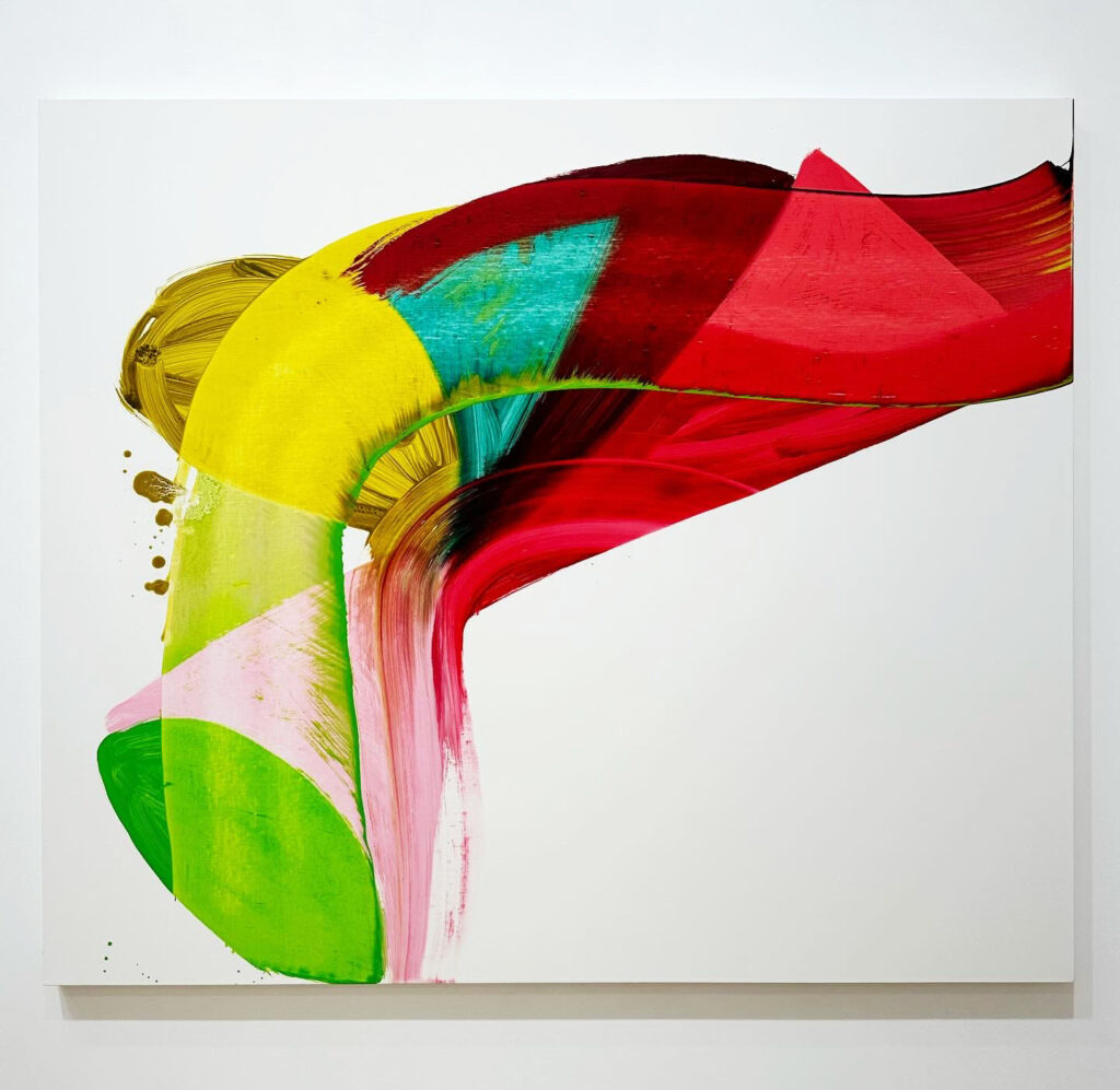
“Valentine”, 2022, oil on linen
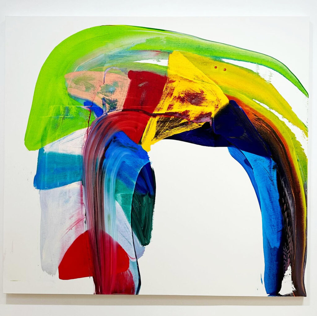
“Braid”, 2022, oil on linen
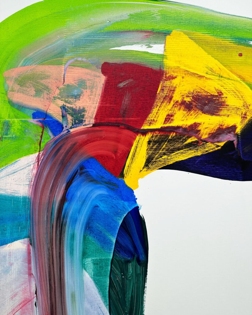
“Braid”, 2022, oil on linen (detail)
The two colorful paintings above are from Andrea Belag’s 2023 solo exhibition, Currents, at Bienvenu Steinberg & J in New York.
From the gallery’s press release-
Since the 1990s, Belag has constantly modified her approach to abstraction through various transitions and mutations. Her internal genealogy matters as much as her relationship to a tradition of abstraction. In the words of artist and critic Julian Kreimer: “it’s not hard to metaphorize those traces, lines left behind by larger swaths of paint that were wiped away, lines whose own shifting colors reveal how they are made by what they’ve touched and changed. But as with so many of Belag’s paintings, the point isn’t to nail down the metaphors (…) Belag’s work becomes an edge condition for painting without flirting with minimalist near-nothingness; it tests out where beauty can emerge, and what we can get to work. It opens up from a few wiped shapes into a sophisticated object able to transport one into a reverie about slippage, slipping away, the here and not hereness of life, death, and the varieties of love”.
Geometry and order have progressively given place to swirling swaths of color, solidity replaced by suspended motion. Painting is an all consuming action. She paints standing up, leaning over and often walking around the canvas placed horizontally. It starts with the arm and as she walks around the canvas her whole body gets involved. Transparent colors on the surface are not fixed and can create form or dissolve into light. She rubs, smudges, and scraps to create translucent, softly luminous surfaces where the brushwork is strikingly visible. “My paintings are contemporary because I paint in the here and now. It’s unavoidable. The artists I feel indebted to are Henri Matisse, Mary Heilmann, Joan Mitchell, Gerhard Richter, Bill Traylor, and Japanese Zen gardens. Style is a dead-end, but I have a point of view. I love transparency and the touch of materials, so I have created a way of painting where I make this possible. I use mostly transparent pigments and fine linen, and I paint wet into wet. The marks are on one layer of the painted surface with very little overlap or pentimento. Color makes space and light come through the paint and emotion comes through as well. There is fear and desire in painting, and that’s addictive. Haptics are the touchstones.” (Andrea Belag, 2023)
Her current solo exhibition, Twombly’s Green, opened this week at Steven Harvey Fine Art Projects.
From their press release-
This grouping of work is, as the title suggests, inspired by Belag’s recollection of Cy Twombly’s use of the color Hooker’s green in his “Pond Paintings.” She writes-
These paintings are inspired by my memory of Twombly’s green and white paintings that I first saw in the Menil Collection in Houston in 2015. I was stunned by his paint handling and his use of Hooker’s Green.
Since then, I learned he painted quickly and directly with his hands. Discovering the “Pond Paintings” was unexpected and I kept thinking about them. Hooker’s green is opaque and dark. But the dark value doesn’t overwhelm the hue. Instead, there is richness and depth without a trace of yellow.
When I identified the pigment and started to paint with it, I felt a vibration. There was a time when painting with green was taboo and now it is ubiquitous.
Is green in the zeitgeist?
All painted within the last twelve months, these works are a continuation of the artist’s practice of lush, energetic abstraction. Playing with circularity in an ongoing attempt to “get away from the grid,” Belag uses color as forms in space, bodies set in motion. Citing foundational inspirations in Matisse and Guston, who she later studied with at the New York Studio School, Belag’s work can also be related to vanguard practitioners of 80s abstraction such as Bill Jensen, David Reed and Mary Heilmann. Her immediate peers Christopher Wool and Joyce Pensato are also compass points in the stripped down dedication to raw painterly brio they share.
This exhibition is on view until 4/13/24.

This mural is by NYC artist Chris Stain and was spotted in Bushwick, Brooklyn in 2020. It is part of Bushwick Collective’s ongoing street art project.
For Chris Stain’s most recent work, check out his Instagram.