admin

Mar 162024
 

Watercolor paintings by Katherine Strobel

There is A LOT of work currently on view at Summit Artspace for their Winter Exhibitions (see the previous two posts) and it is worth mentioning these shows as well.

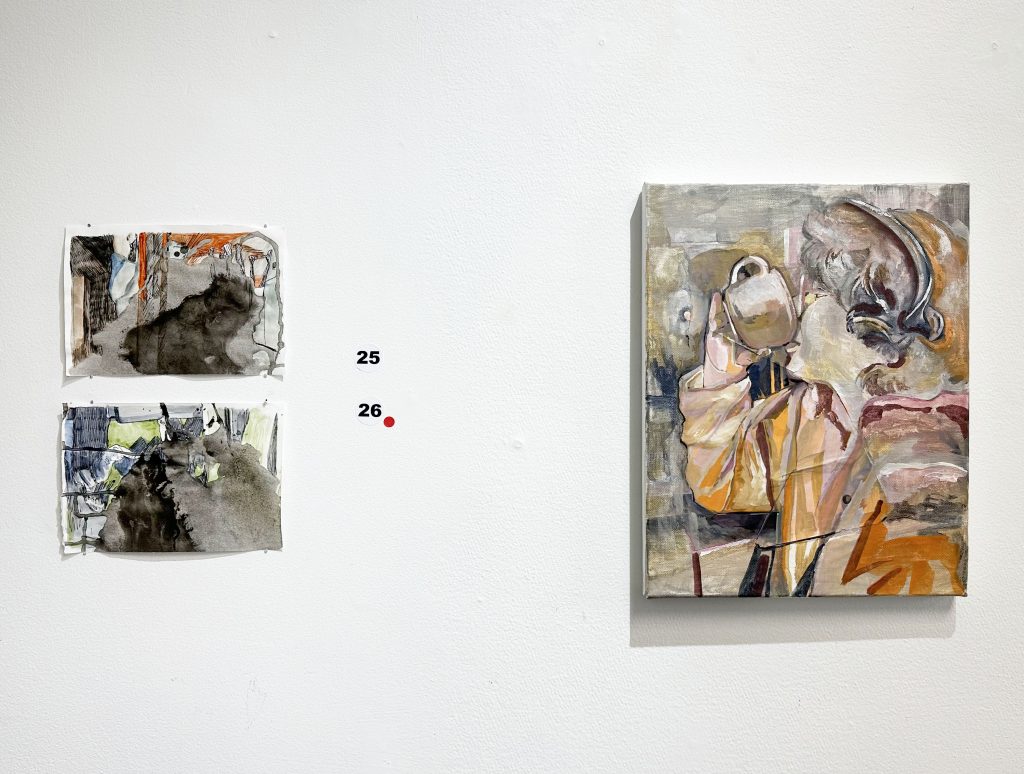
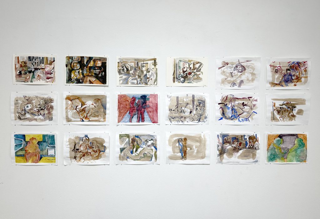
In the Welcome Gallery are watercolor paintings (seen above) by Katherine Strobel, for her exhibition, Bad Nostalgia.

Her statement about the work-

People forget to take pictures of things that don’t matter because it’s impossible to photograph qualities such as the feeling of an inside joke, the sound of an exhale through the nose, or dirty silverware that must be returned to the kitchen and replaced. These things act as set, pieces for what make up the rest of our lives. This series is a catalog of work that focuses on memory and candidness of a scene or subject. The people pictured are painted from life or candid photographs which are then emphasized from a naive image to something more. When an image is exaggerated with new colors and shapes it serves to make the mundane more desirable. The paintings are watercolors with a textured surface; the texture creates a sense of play with paper elements. In my work watercolor is often indicative of memory because of its ephemeral quality and transparent layers. This is because of how impossible it is to clarify every element that makes up a color when the layers are all compressed and viewed as a complete state.

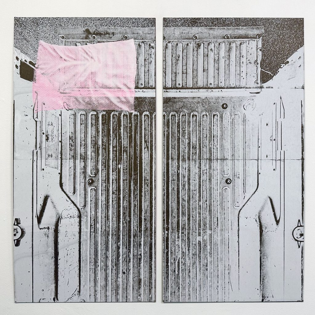
Below are works from FRESH, an annual exhibition of local artists juried by Pita Brooks, Executive Director of Akron Soul Train. The website has all of the artists included and their statements and bios- definitely worth taking a look at what is being created in the area.

Michelle Eisen, “I’ve Made My Bed”, Silkscreen on hardboard

Steven Mastroianni “Fathomable Series #24”, Unique cameraless photogram, silver gelatin print

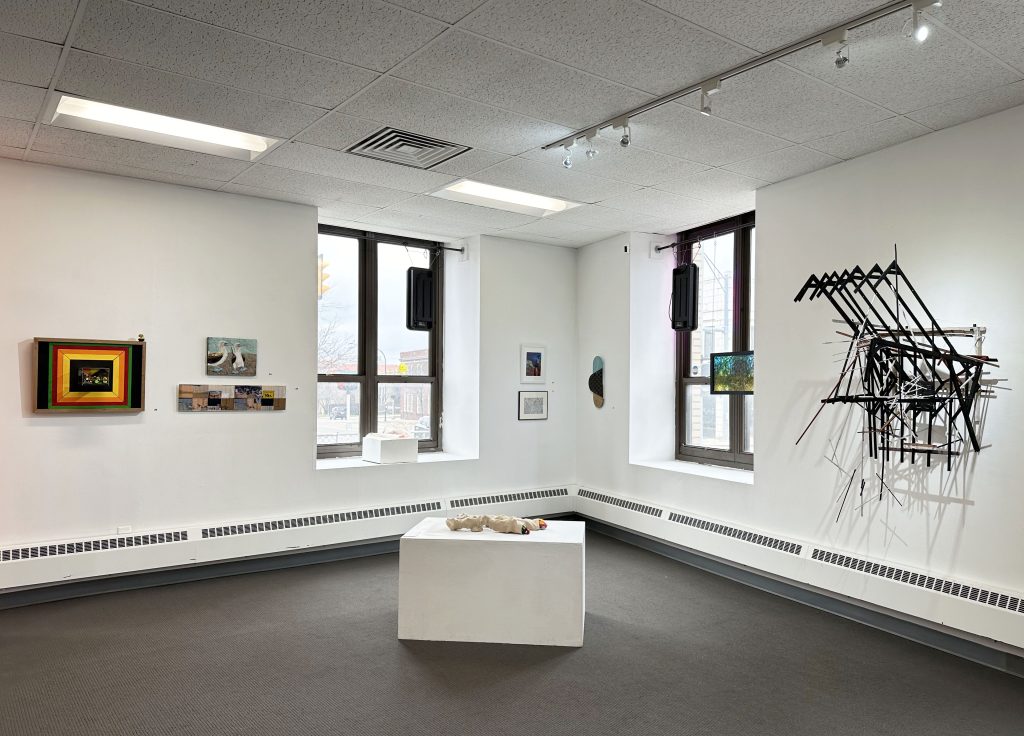
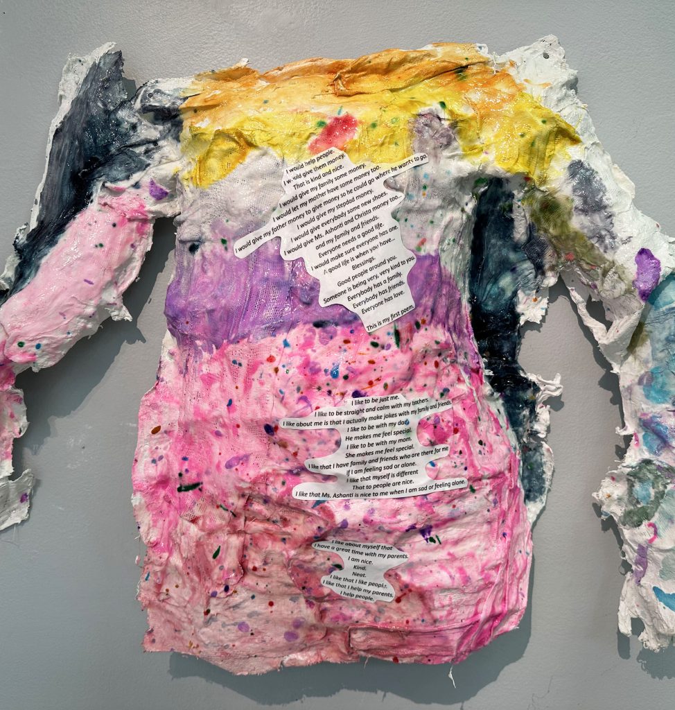
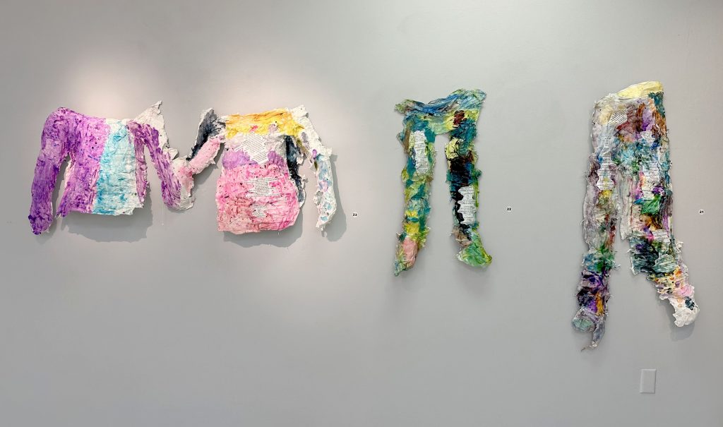
Finally, on view throughout the building are works by local students, teachers, and school leaders for Taking Care of Our House: Communities Coming Together and Making a Difference. The exhibition is made with the organization Art Resistance Through Change (ART-C). The works pictured below are a few of the sculptures created that included the personal narratives of the artists.

It’s worth mentioning that along with these exhibitions there are artists studios and galleries also in the building and worth checking out. Summit Artspace is open Fridays 12-7pm and Saturdays 11am-5pm.

Mar 162024
 

Stephen Tornero “Don’t Tell Me” Hand dyed wool, acrylic rods

Chad Troyer “Crashing Waves” (bottom) and “Calming Shores” (top) Jacquard-woven, gradating waffle weave; Cotton, linen, rayon, silk, birch

Jen P. Harris “Oscillator” (left) and “Sphinx” (right) Hand-woven cotton, canvas, gesso, and thread on wood stretcher bars//Hand-woven cotton, canvas, thread, and acrylic paint on wood stretcher bars

Trey D. Gehring, “Stacked” Woven cotton yarn, crocheted acrylic yarn, fabric paint

Etta Sandry “Pivot: Moi-même” and “Pivot: Big Squish”, Cotton and cottolin, handwoven on Jacquard loom//Cotton and wool, handwoven on Jacquard loom

There are some incredible pieces in Waffle Weave Invitational, one of the current exhibitions at Summit Artspace. A few selections are pictured, but head to the gallery’s website to see all of the work on view.

From curator Stephen Tornero (who also has work in the show)-

This show was conceived as an idea to focus on a specific structural variable of a textile, and see how many different variations artists, artisans, and craftspeople would be able to produce. While researching the development of weaving technology, a loom with the capability to create complex structures was developed around 600 CE simultaneously in different cultures. This structure could have been produced by these looms, but also could have been designed much earlier by hand-manipulation of threads by the weaver. The waffle structure is so unique in its ability to transform a textile- seemingly a two dimensional surface- into a three dimensional object that has depth as shown by many repeated square pyramidal cells. Historically, this structure was used to create a textile that would hold water in its cells for cleaning or drying, or to help insulate the body with tiny pockets of air.  This structure can be modified by changing the color of the threads with which it is woven, the fiber content of those threads, or even by expanding the amount of threads used in a cell, expanding the scale. 

Statements from the artists about the work pictured above (from the Summit Artspace website)-

Stephen TorneroDon’t Tell Me– “This piece is part of a continuing study of material, color, and structure in textiles. I have been mesmerized with the “waffle weave” structure and its ability to create large, three dimensional pockets of space. This pieces experiments with the combination of the flexible, fibrous wool yarns with the rigid neon acrylic rods. These two materials are combined in a large textile in order to explore the effects that this unique weaving structure will have on these materials. This use these two opposing materials in the piece creates a dialogue between the traditional usefulness of this wool weaving and its display on the wall as a work of art.”

Chad TroyerCrashing Waves and Calming Shores– “The gradating structure allows for the weft to float acrost the surface of the weaving for varying lengths, from half an inch to nearly the whole width. The warp is allowed to float for varying lengths, but not nearly as long as the weft. After it was taken off the loom, the weaving was stretched. Parts of it were pulled, and others were left loose, allowing the floats to be accented by the folding and tautness of the cloth. The two pieces are the same piece of cloth cut apart, however they both display a different state of being: turbulent & calm.”

Jen P. HarrisOscillator and Sphinx– “These small weaving-painting hybrids are part of an ongoing, experimental body of work in which I am developing a heterogeneous formal language that both honors and questions histories and conventions of painting and weaving.”

Trey D. GehringStacked– “Stacked follows a line of investigation by the artist into a poststructuralist analysis of language as a system of symbols that lack meaning beyond context. The piece melds the namesake with the woven structure itself creating a hyper-literal interpretation of the exhibition’s theme. However, an understanding of the theoretical underpinning is unnecessary and secondary to the enjoyment of the whimsical and humorous nature of the work.”

Etta SandryPivot: Moi-même and Pivot: Big Squish- “My woven work focuses on samples that explore dimensionality in woven cloth using techniques such as multi-layer weaving, pleating, and woven structures that are elastic, self-shaping, and otherwise transformative, like the pocketed cells of waffle weave. This work creates a series of translations between the flat draft and the materiality of the cloth. Weaving is a technically binary structure: a warp thread can be either raised or lowered. When drafted, woven structure is drawn as a flat grid. Woven in multiple layers, cords, and pleats, weaving maintains its inherent binary nature but takes on a new physical dimensionality. Between the flat draft and the woven cloth, there is an unknowable material transformation that reflects the nuance, radical variation, and possibility that emerges from a seemingly set and limited system. In these works, this variation is expressed through two large waffle weave samples that test the limits of the waffle structure. Each piece weaves the same design of increasingly large waffle cells. Moi-même presents a balanced the waffle weave in which warp and weft threads of a similar weight and color draw out a subtle loosening of the structure as the size of the cells increase. In The Big Squish, the waffle structure is boldly packed, extended and distorted by colorful wool wefts.”

This exhibition closes 3/16/24.

Mar 162024
 

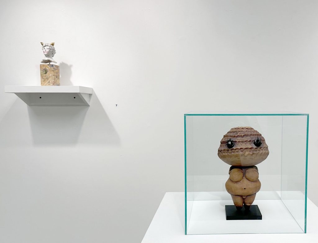
David Kruk’s solo exhibition Nobody Here at Summit Artspace in Akron, asks questions about the state of culture (or lack of culture) we are currently experiencing. Is the difference between the Venus of Willendorf and a Funko Pop just time period and material? Using the Vaporwave aesthetic, a remix of past pop culture in itself, he explores consumerism and nostalgia. Walking around the empty spaces in his video game creation, one is left wondering- what comes next?

The artist’s statement about the work-

This exhibition will consider Mark Fisher’s concept of “lost futures” through the aesthetics of Vaporwave and Funko Pops. I am interested in how these anachronistic objects utilize nostalgia through the remixing of cultural references to engage with consumer capitalism. According to Fisher, this continual referencing of the past exemplifies contemporary society’s cultural stagnation and the erosion of collective imagination towards a radically transformative future.

The sculptures in the exhibition are intended to push these anachronisms a bit further; to undergo a life cycle of adaptation and re-contextualization. I enjoy thinking about the ways in which something like Vaporwave can function as a critique of consumer culture, questioning capitalism’s impulse to commodify everything in sight, including our identities and memories. Vaporwave was born from the internet, and its aesthetic continues to be quite popular within online communities. These communities may often be collectors of pop culture paraphernalia: such as Funko Pops, which I’ve become interested in for their cultural symbolic value. Collecting Funko Pops can provide a source of aesthetic stability for some, while simultaneously operating as totems for coping with the realities of adulthood.

Conceptually within this exhibition, I wonder about the ideological trajectory from ritualistic idol to mass-produced fandom figurine, how capitalism influences our engagement with nostalgia, how the concept of a collectible operates within the spheres of the household to the museum, and how an art object may change over time through being digested through the body of consumerism.

For the video below, available on the gallery’s website, Kruk discusses his work – from tracing images using an oven light as a child, to a growing interest in sculpture, to creating the interactive video game from the show.

This exhibition closes 3/16/24.
Mar 152024
 

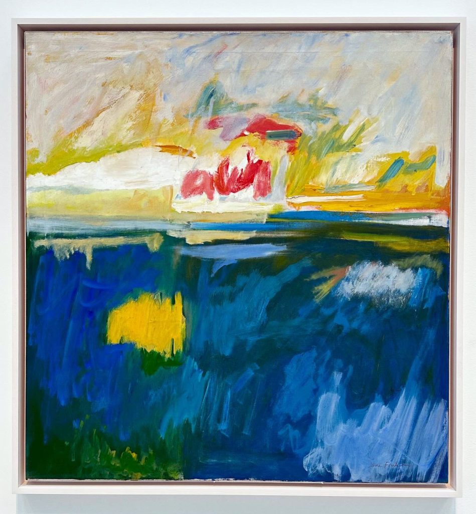
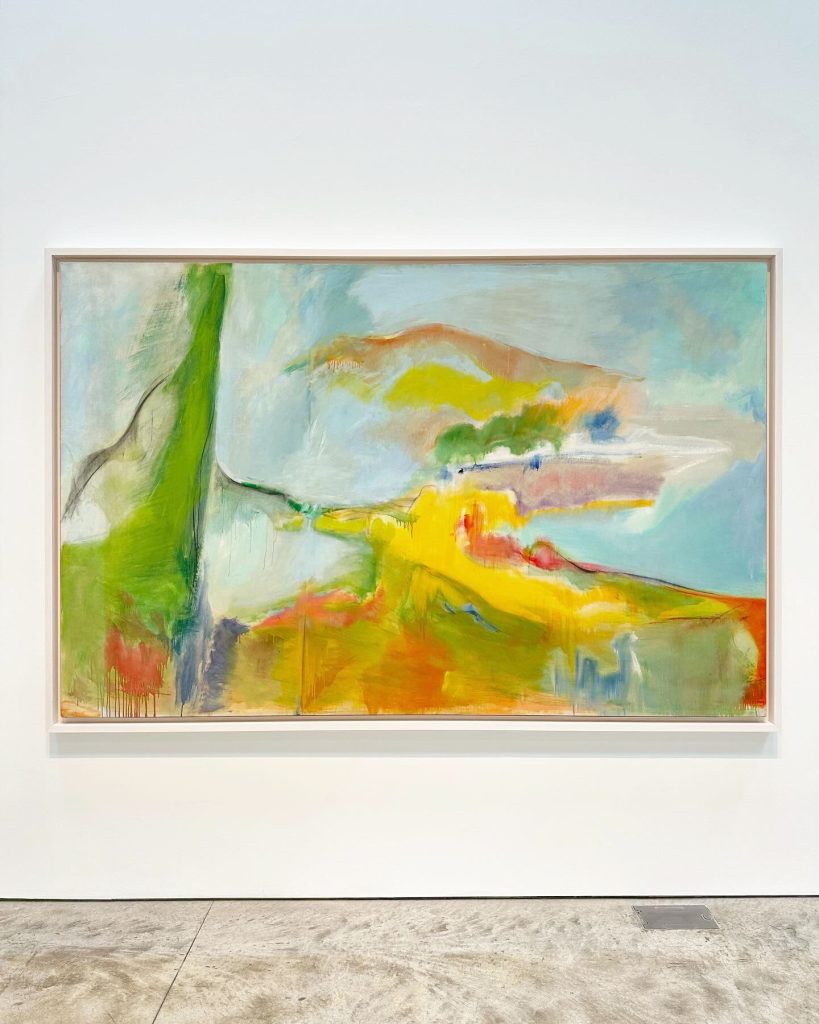
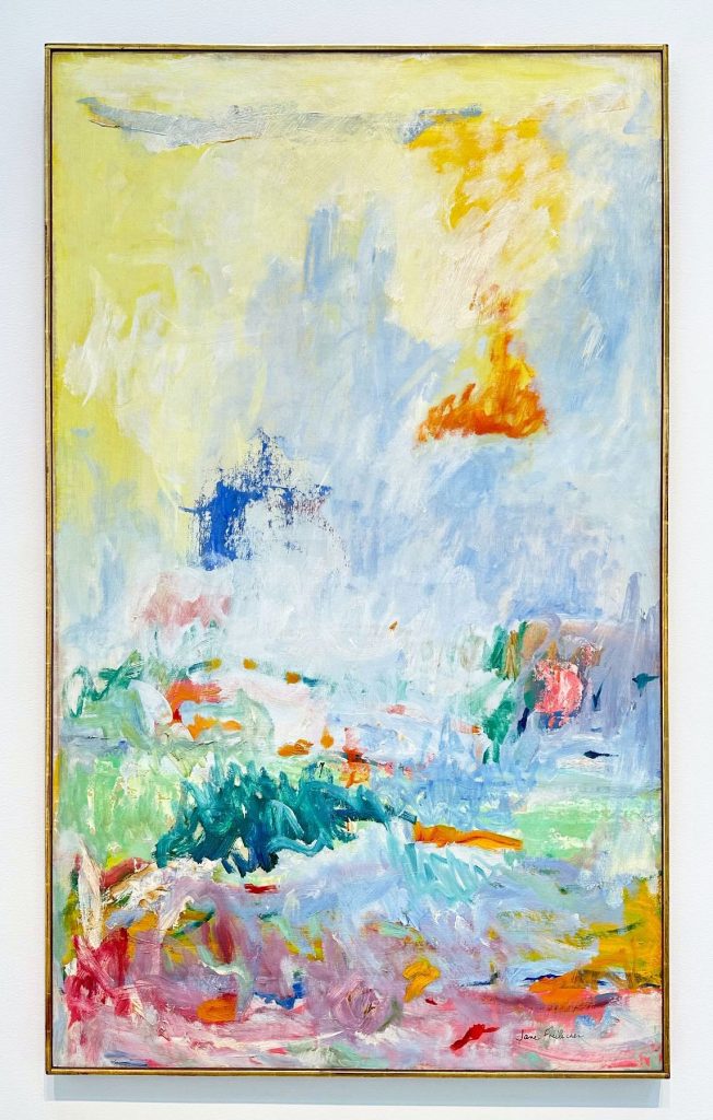
“Northern Lights”, 1959, oil on linen

“Untitled (Near the Cove)”, c. 1958, oil on linen

“Fresh Air”, c.1958-1962, oil on canvas

Although better known for her figurative paintings, Jane Freilicher also created several large abstract paintings which were on view last year at Kasmin gallery in NYC.  The paintings hint at a recognizable landscape, but through her use of color and energetic brush strokes she evokes the feeling of being immersed in the beauty of nature- without the boundaries of a more realistic representation.

From the gallery about the work-

The exhibition presents a group of paintings in degrees of abstraction, realized by Freilicher between 1958 and 1962, a period of great inventiveness when the artist was spending stretches of time in Long Island but had yet to establish a studio there. The series marks a crucial moment of discovery and focus for Freilicher, who went on to integrate the freedom, fluidity, and confidence developed during this period into her more recognizable still lifes and landscapes of later decades.

Freilicher’s abstractions have their roots in observation, informed by her studies with legendary abstract painter Hans Hofmann at his schools in New York and Provincetown. In this group of paintings, pastoral landscapes from Water Mill, Long Island, are translated through the lens of the artist’s memory into confident gestural compositions defined by their use of color and sensitive depiction of light. In a 2006 interview for The New York Sun, the artist tells writer Jennifer Samet of this evolutionary moment in her practice: “I remember being overwhelmed by aqueous light and the obliteration of the horizon by fog.” Freilicher’s palette returns repeatedly here to a combination of off-white and light blue, rendered in loose brushwork across an expansive pictorial space to give a palpable impression of the airy, open landscape of the country.

Breaking out of the domestic scale necessitated by previous studio spaces, this generative period saw Freilicher regularly visiting Water Mill and then returning to her Manhattan studio where she would collapse the formal elements of the rural and coastal environments into energetic, improvisational paintings that were significantly larger than her earlier works. While approaching pure abstraction, the paintings from this period retain a compositional recognition of their ordering principles—the horizon line, a boat’s mast, the position of the sun in the sky, and, in the artist’s words, “long vistas of clouds and water.”

The metamorphosis of landscapes that figure prominently in the artist’s life are representative of, as Roberta Smith identified in 2006, “a more personal, grounded version of Color Field painting.” This observation bridges Freilicher to a loose group of contemporaries whose considerations of their immediate environments brought great warmth and aliveness to varying shades of abstraction—Milton Avery, Etel Adnan, Joan Mitchell, Agnes Martin, and Willem de Kooning (whose own abstract landscapes inspired by his time on Long Island went on view at Sidney Janis Gallery in 1959).

Mar 152024


The mural above is a reproduction of Masumi Hayashi’s Edgewater Park no.2, Cleveland, OH. The mural is located in Cleveland and is one of the many public art projects organized by LAND Studio.

From the information plaque next to the mural about the artist-

Masumi Hayashi (1945- 2006) was a visionary fine art photographer who taught at Cleveland State University for 25 years. During her time in Cleveland, she lived in the Gordon Square neighborhood in the first residential development project of the Detroit Shoreway Community Development Organization. Dr. Hayashi was a beloved neighbor, friend, and local artist. She achieved global success with her signature format, the panoramic photo collage.

Hayashi was born in the Gila River War Relocation Camp in Rivers, Arizona, which was one of the U.S. government’s Internment camps for Japanese-Americans during World War II. Hayashi created her striking panoramic photo collages by assembling individually shot color photographs into a composition, like tiles in a mosaic. She shot photographs in a meticulously ordered sequence using a completely manual, non-digital film camera on a tripod. A single piece could take four to eight hours to shoot, and she might not see the results for days or weeks. When working at a site, she had to imagine the composition she desired from a location, and then create the individual photographs, while considering factors like time of day, weather, and location of the sun, through the entire shoot. Many of her large panoramic compositions involve more than one hundred individual photographic prints.

Much of Hayashi’s work explores socially difficult subjects, like the Japanese-American Internment camps, abandoned prisons, and EPA Superfund cleanup sites. She was able to create artwork that makes difficult subjects approachable. Her earlier work includes many significant sites in Cleveland, including the Cultural Gardens, RTA stops, Lake Erie and Edgewater Park (as seen in the artwork shown to the left). Later in her career, her artwork reflected a deep interest in culturally significant spiritual sites in India, Nepal, Japan, and Thailand.

Mar 112024
 

The Fourth Wall- Never A Part

Portland band The Fourth Wall released this single in 2023 which will be on their upcoming album RETURN FOREVER, releasing 3/15.

They are currently on tour and will be opening for Typhoon on Saturday, 3/16/24, at Echoplex in Los Angeles.

Mar 092024
 

The mural above, Celestial Tigers, located outside the Oceanic Market building in Tampa, is by Florida artist Michelle Sawyer.

She is currently showing recent paintings at Parachute Gallery, located in the Kress Contemporary building in Ybor City.

Also check out her Instagram for recent work.

Mar 082024
 

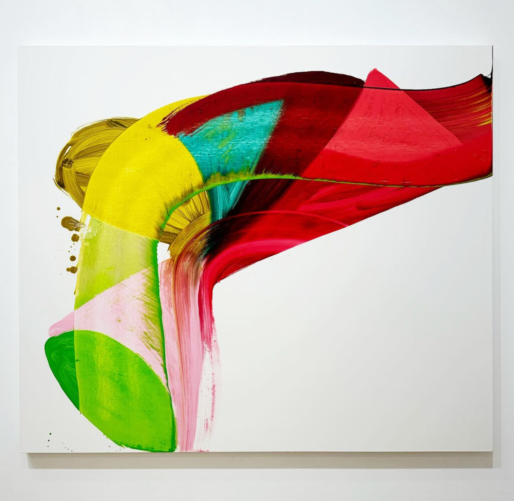
“Valentine”, 2022, oil on linen

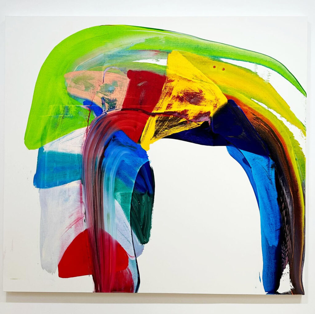
“Braid”, 2022, oil on linen

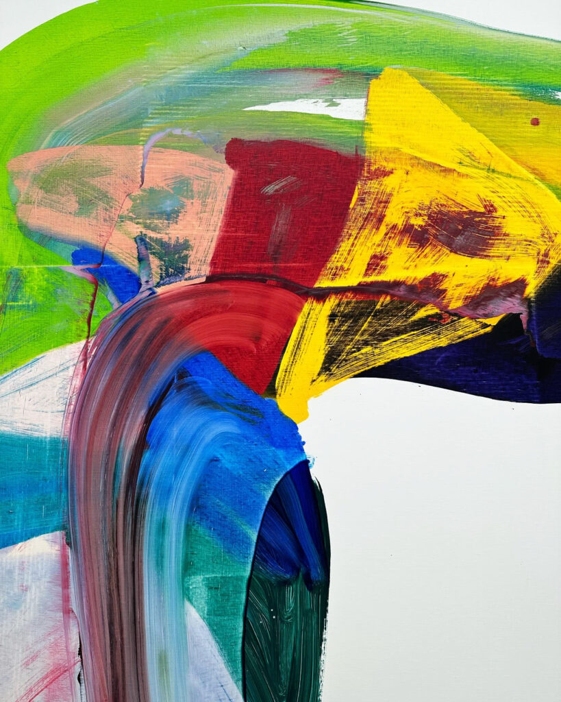
“Braid”, 2022, oil on linen (detail)

The two colorful paintings above are from Andrea Belag’s 2023 solo exhibition, Currents, at Bienvenu Steinberg & J in New York.

From the gallery’s press release-

Since the 1990s, Belag has constantly modified her approach to abstraction through various transitions and mutations. Her internal genealogy matters as much as her relationship to a tradition of abstraction. In the words of artist and critic Julian Kreimer: “it’s not hard to metaphorize those traces, lines left behind by larger swaths of paint that were wiped away, lines whose own shifting colors reveal how they are made by what they’ve touched and changed. But as with so many of Belag’s paintings, the point isn’t to nail down the metaphors (…) Belag’s work becomes an edge condition for painting without flirting with minimalist near-nothingness; it tests out where beauty can emerge, and what we can get to work. It opens up from a few wiped shapes into a sophisticated object able to transport one into a reverie about slippage, slipping away, the here and not hereness of life, death, and the varieties of love”.

Geometry and order have progressively given place to swirling swaths of color, solidity replaced by suspended motion. Painting is an all consuming action. She paints standing up, leaning over and often walking around the canvas placed horizontally. It starts with the arm and as she walks around the canvas her whole body gets involved. Transparent colors on the surface are not fixed and can create form or dissolve into light. She rubs, smudges, and scraps to create translucent, softly luminous surfaces where the brushwork is strikingly visible. “My paintings are contemporary because I paint in the here and now. It’s unavoidable. The artists I feel indebted to are Henri Matisse, Mary Heilmann, Joan Mitchell, Gerhard Richter, Bill Traylor, and Japanese Zen gardens. Style is a dead-end, but I have a point of view. I love transparency and the touch of materials, so I have created a way of painting where I make this possible. I use mostly transparent pigments and fine linen, and I paint wet into wet. The marks are on one layer of the painted surface with very little overlap or pentimento. Color makes space and light come through the paint and emotion comes through as well. There is fear and desire in painting, and that’s addictive. Haptics are the touchstones.” (Andrea Belag, 2023)

Her current solo exhibition, Twombly’s Green, opened this week at Steven Harvey Fine Art Projects.

From their press release-

This grouping of work is, as the title suggests, inspired by Belag’s recollection of Cy Twombly’s use of the color Hooker’s green in his “Pond Paintings.” She writes-

These paintings are inspired by my memory of Twombly’s green and white paintings that I first saw in the Menil Collection in Houston in 2015. I was stunned by his paint handling and his use of Hooker’s Green.

Since then, I learned he painted quickly and directly with his hands. Discovering the “Pond Paintings” was unexpected and I kept thinking about them. Hooker’s green is opaque and dark. But the dark value doesn’t overwhelm the hue. Instead, there is richness and depth without a trace of yellow.

When I identified the pigment and started to paint with it, I felt a vibration. There was a time when painting with green was taboo and now it is ubiquitous.

Is green in the zeitgeist?

All painted within the last twelve months, these works are a continuation of the artist’s practice of lush, energetic abstraction. Playing with circularity in an ongoing attempt to “get away from the grid,” Belag uses color as forms in space, bodies set in motion. Citing foundational inspirations in Matisse and Guston, who she later studied with at the New York Studio School, Belag’s work can also be related to vanguard practitioners of 80s abstraction such as Bill Jensen, David Reed and Mary Heilmann. Her immediate peers Christopher Wool and Joyce Pensato are also compass points in the stripped down dedication to raw painterly brio they share.

This exhibition is on view until 4/13/24.


Mar 072024
 

Francesca Woodman, “Untitled (Rome), 1977-8, Gelatin silver print (image via Columbus Museum of Art)

Two of Cindy Sherman’s “Film Stills”, Gelatin silver prints from the 1970s

Four Gelatin silver prints by Diane Arbus

Francesca Woodman’s “Italy”, 1977-1978 (printed later) Gelatin silver print

Currently on view at Columbus Museum of Art is Arbus • Sherman • Woodman: American Photography from the 1960s and 1970s. Although many of these photographs by Diane Arbus, Cindy Sherman and Francesca Woodman are well known, it’s great to see the work of these three exceptional artists in person. The black and white images still captivate, even in our current image saturated world.

About the show from the museum-

This selection of monochromatic prints reflects a shared interest in capturing the world outside oneself as well as the world within. Perspective is an elemental link between each work: the images speak to how we see ourselves as individuals, how we are perceived, and how we observe others.

While Arbus was known for photographing families, children, pedestrians, performers, and celebrities, both Sherman and Woodman turned the camera on themselves. Dressing as anonymous female film characters from the 1950s and 1960s, Sherman poses in the series “Untitled Film Stills”. However, these works are not considered self-portraits, but rather carefully constructed performances of various female identities. Conversely, Woodman’s surrealist images might be called non-traditional self-portraits. By obscuring, blurring, or cropping parts of herself out of the final image, the photographs become intimate, personal snapshots that reflect a wider human fragility.

Arbus, Sherman, and Woodman are considered among the most prominent twentieth-century photographers and remain influential to contemporary artists today. By including aspects of feminism in their work and pushing the limits of the medium, these women challenged societal norms of their time while contributing to the elevation of photography as an art form.

It’s always interesting to hear artists discuss each other’s work. Included in the exhibition is this quote by Cindy Sherman about Francesca Woodman-

“She had few boundaries and made art out of nothing: empty rooms with peeling wallpaper and just her figure. No elaborate stage set-up or lights… Her process struck me more the way a painter works, making do with what’s right in front of her, rather than photographers like myself who need time to plan out what they’re going to do.”

For more on Francesca Woodman, her short life, and her artistic family, The Woodmans is an excellent documentary.

Mar 052024
 

Edward Hopper’s oil painting Morning Sun, 1952, is part of Columbus Museum of Art’s permanent collection. The model for the painting was his wife, Jo.